10

I need to draw 20 distributions in a single graph in R, and it doesn't look good (cluttered) to me with regular boxplot (20 boxes) even with boxwex=0.3. Could you suggest me how can I plot a kind of boxplot in R for the 20 distributions, with dots for median and just a line instead of box, like the one below. Please also suggest me if there is any R method that produces nice boxplots, specifically if you want to show several distributions in a single graph.

 -----0----
samarasa
  • 1,467

4 Answers4

14

(This is really a comment, but because it requires an illustration it has to be posted as a reply.)

Ed Tufte redesigned the boxplot in his Visual Display of Quantitative Information (p. 125, First Edition 1983) precisely to enable "informal, exploratory data analysis, where the research worker's time should be devoted to matters other than drawing lines." I have (in a perfectly natural manner) extended his redesign to accommodate drawing outliers in this example showing 70 parallel boxplots:

Tufte boxplots

I can think of several ways to improve this further, but it's characteristic of what one might produce in the heat of exploring a complex dataset: we are content to make visualizations that let us see the data; good presentation can come later.

Compare this to a conventional rendition of the same data:

Conventional boxplots

Tufte presents several other redesigns based on his principle of "maximizing the data ink ratio." Their value lies in illustrating how this principle can help us design effective exploratory graphics. As you can see, the mechanics of plotting them amounts to finding any graphics platform in which you can draw point markers and lines.

whuber
  • 322,774
  • Could you help in drawing the top graph in R? – samarasa Aug 05 '11 at 21:43
  • 1
    @kkp Here's a rough draft. Nice response (+1). – chl Aug 05 '11 at 23:29
  • And here are further possibilities in R -- found on SO: Functions available for Tufte boxplots in R?. – chl Dec 02 '11 at 14:48
  • @chl Thank you for the link. For the record, it includes working R code for producing these redesigned boxplots. Interestingly, that question was posted just three days after this one... – whuber Dec 02 '11 at 14:56
  • @whuber: nice example. I assume that's random data. I have difficult believing that having 70 box plot with arbitrary ordering on a single plot would be a good idea in a real situation. Also, your traditional example has touching boxes, which is just a problem of resolution, but makes it much harder to read. The tufte plots do look good here though. one improvement that might be made is to make the outliers colored, so that they match their boxes. – naught101 Nov 17 '12 at 22:50
  • 2
    @naught Interesting observations. One potential use of such boxplots is a variant of Tukey's "wandering schematic plot" in which a (large) scatterplot is sliced along the x-coordinate and the y-values are summarized by a boxplot in each bin. Such a procedure can easily generate 70 or more side-by-side boxplots. Applications include almost any multidimensional data: for instance, the x-coordinate might represent a soil depth sampled every centimeter and the y-coordinate might represent data obtained at multiple locations. – whuber Nov 17 '12 at 22:54
  • True. I was thinking that a good use case is when the x axis is ordered, which it clearly would be in that case. Then Tufte plots would certainly be better than boxplots. But there are lots of other plots that could work in that situation too, better than either type (like heat maps, or violin plots, if the data isn't close to norm). – naught101 Nov 18 '12 at 11:46
  • I disagree that this is a particularly illuminating plot. Sure, it has colors and dots, so it's pretty. But it's also crammed and very hard to read, so it's not informative. Not having labels on the x axis makes if, in my opinion, quite useless. It will be next to impossible for example for find one particular distribution out of the 70 shown. – dipetkov Jul 23 '22 at 11:06
11

Beanplots

Possibly the coolest plots ever, these are basically a small-multiples implementation of violin plots. Violin plots have a massive advantage over boxplots: they can show a lot more detail for distributions that aren't normal (e.g. they can show bi-modal distributions really well). Because they're usually based on Gaussian smoothing (or similar), they won't work really well for distributions with high end points (like exponential distributions), but then, neither will boxplots.

Beanplots can be achieved very easily in R - just install the beanplot package:

library(beanplot)

Sampling code from Greg Snow's answer:

my.dat <- lapply( 1:20, function(x) rnorm(x+10, sample( 10, 1), sample(3,1) ) )

beanplot(my.dat)

Beanplot!

The beanplot function has tons of options, so you can customise it to your heart's desire. There's also a way to do beanplots in ggplot2 (need the latest version):

library(ggplot2)

my.dat <- lapply(1:20, function(x) rnorm(x+10, sample(10, 1), sample(3,1))) my.df <- melt(my.dat) ggplot(my.df, aes(x=L1, y=value, group=L1)) + geom_violin(trim=FALSE) + geom_segment(aes(x=L1-0.1, xend=L1+0.1, y=value, yend=value), colour='white')

GGplot2 beanplot

naught101
  • 5,453
4

Here is some sample R code for a couple of ways to do it, you will probably want to expand on this (include labels etc.) and maybe turn it ito a function:

my.dat <- lapply( 1:20, function(x) rnorm(x+10, sample( 10, 1), sample(3,1) ) )

tmp <- boxplot(my.dat, plot=FALSE, range=0)

# box and median only
plot( range(tmp$stats), c(1,length(my.dat)), xlab='', ylab='', type='n' )
segments( tmp$stats[2,], seq_along(my.dat), tmp$stats[4,] )
points( tmp$stats[3,], seq_along(my.dat) )

# wiskers and implied box
plot( range(tmp$stats), c(1,length(my.dat)), xlab='', ylab='', type='n' )
segments( tmp$stats[1,], seq_along(my.dat), tmp$stats[2,] )
segments( tmp$stats[4,], seq_along(my.dat), tmp$stats[5,] )
points( tmp$stats[3,], seq_along(my.dat) )

enter image description here

naught101
  • 5,453
Greg Snow
  • 51,722
1

You have decided to use a boxplot to summarize each of the 20 distributions.

A boxplot is a 5-number summary: it shows the minimum, lower quartile, median, upper quartile, and maximum. It has advantages (it's simple and well-known) as well as disadvantages (How should we do boxplots with small samples?).

There are other ways to visualize a sample from a distribution and, depending on your actual data, one of the alternatives may work better than a boxplot: If there are a few observations from each distribution you can show the raw data in a Wilkinson dot plot (aka a stacked dot plot). If the samples are larger (at least ~30 points per distribution), you can make a histogram (with 10-12 bars since there are 20 histograms to show) or a kernel density (smooth histogram).

There is also the question how to put together the individual representations of 20 distributions. A small multiples graphics, with several panels arranged in a grid, can be very effective. In your case there will be 20 panels, one for each distribution, so it's necessary to pare down the details in each panel. However the juxtaposition with common x- and y-axes makes comparisons between distributions very intuitive.

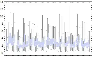
Here is an illustration. I draw 50 observations from 20 distributions: 16 distributions are Normal(0,1) and 4 distributions are Normal(1,2). I estimate and plot the density of each sample and use color to highlight the "unusual" distributions. You can use color to indicate different experimental conditions or the levels of a categorical variable, if relevant.

enter image description here

This example is inspired by David MacKay's Information Theory, Inference, and Learning Algorithms. This book is full of amazing graphics, all without color. Chapter 21 has several small multiples plots which represent different combinations of the mean $\mu$ and variance $\sigma^2$ of the Normal distribution, in a mixture of two Normals.

[1] D. J. MacKay. Information Theory, Inference, and Learning Algorithms (2003). Available free online.

dipetkov
  • 9,805