0

enter image description here

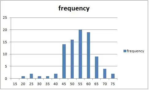
Histogram showing the frequency for test scores (range 15-75) for a total of 91 students.

Glen_b
  • 282,281
  • The data looks fairly normal to me (maybe a little skewed to the left) but this is subjective. Have you tried the Kolmogorov-Smirnov test (http://en.wikipedia.org/wiki/Kolmogorov%E2%80%93Smirnov_test) to see if your data appears to come from a normal distribution? – Dan Sep 03 '14 at 18:56
  • 1
    It depends on the tests you have in mind. The data clearly do not come from a Normal distribution, but the sampling distributions of many common test statistics, such as the sample mean, will be close to Normal anyway. The sampling distributions of some other test statistics, though, might differ appreciably from those predicted by a Normal distribution assumption for the data. For more about this you can find hundreds (if not thousands) of threads on this site discussion this issue in specific contexts. – whuber Sep 03 '14 at 21:00
  • Cosmetic but to many important detail: Whenever histogram bars refer to contiguous intervals, as appears likely here, then they should touch. (MS Excel I guess to be providing lousy defaults here.) – Nick Cox Sep 03 '14 at 21:02
  • @NickCox, yea, I wasn't sure if he/she was actually using a histogram or bar chart and if he/she really only has values at increments of 5. – Dan Sep 03 '14 at 21:05
  • @Nick Could you amplify on why that might be important? By definition a histogram uses area, rather than height, to represent relative frequency. Provided the bars have widths in constant proportion to the intended ones, they will continue to represent relative areas to full accuracy. – whuber Sep 03 '14 at 21:06
  • 1
    "Important" in the sense that the graph should reflect the nature of the data as a matter of clarity and even honesty. If the data are discrete to the extent that only multiples of 5 are possible, it would be better to show thin spikes. If essentially every score in the range is possible, touching bars are better (although I wouldn't object to each possible value getting its own spike). I know no more of the data than anybody else, but I am imagining integer scores. – Nick Cox Sep 03 '14 at 21:09
  • @Nick Thank you, I think I see: there is ambiguity concerning whether the plot shows data bins or if the data actually have been rounded recorded only to the nearest multiple of $5$. By visually separating the bars, the plot suggests the latter, whereas in the context of asking about a Normal (continuous) distribution one would expect it to be the former. That is a subtle but interesting point that I will bear in mind when generating such plots. – whuber Sep 03 '14 at 21:15
  • Otherwise put, the degree of discreteness of the distribution is another way in which a distribution can depart from normal or Gaussian (or any other continuous reference distribution). It's not often crucial, but it needs to be thought about. (Some will want to emphasise that distributions are either discrete or continuous, but as George Orwell might have pointed out, some are more discrete than others.) – Nick Cox Sep 03 '14 at 21:23
  • 1
    With a histogram one must be careful of using only a few bins to assess distributional shape; it's possible to be drastically misled. If the shape is giving an accurate impression of the shape, you have mild left skewness, which won't matter much for t-tests, ANOVA or regression, but which might matter a lot if you're doing an F-test for a ratio of variances. You're quite right, though to assess suitability by diagnostic display rather than by formal hypothesis test. – Glen_b Sep 04 '14 at 02:14
  • Further, the assumptions for t-tests, ANOVA and regression apply to the conditional distribution. If you're assessing the distribution of the response on its own (i.e. the marginal distribution), that won't directly relate to the actual assumptions. – Glen_b Sep 04 '14 at 02:31

2 Answers2

1

So this question is hard to answer given that we don't actually have your dataset and can only guess at what the data values actually are. However, based on your plot the data looks fairly normal to me (maybe a little skewed to the left) but this is subjective.

I guessed at what your data was from the plot and ran the Shapiro-Wilk test on it to test for normality. Here is what "my" data looks like:

enter image description here

Now, the null hypothesis under the Shapiro-Wilk test is that the data follows a normal distribution. Running the test, in R, I obtained the following results:

> shapiro.test(x)

        Shapiro-Wilk normality test

data:  x
W = 0.9391, p-value = 0.0002158

and so we have a p-value = 0.0002158 which is highly significant and indicates that we should reject the null hypothesis and conclude that normal distribution is probably not a good fit for this data.

Thus, based on the test, I would advise that it would be incorrect to apply tests appropriate for normal distributions to this data set.

I am posting my R code in case anyone else would like to run it or if anyone else would like to try different values for the data I constructed.

setwd("/home/dan/Desktop/")

x = c(rep(20,2),rep(25,3),rep(30,2),rep(35,2),rep(40,3),rep(45,14),rep(50,16),rep(55,20),rep(60,19),rep(65,9),rep(70,4),rep(75,3))
y = table(x)

jpeg("barplot.jpeg")
barplot(y)
dev.off()

shapiro.test(x) 
Nick Cox
  • 56,404
  • 8
  • 127
  • 185
Dan
  • 1,140
  • Wilk (Martin B. Wilk), as in this test, and Wilks (Samuel S. Wilks), as in Wilks' lambda, are easily to conflate. I've edited to separate. – Nick Cox Sep 03 '14 at 20:52
  • 3
    This answer clearly shows application of a standard test, but the approach is statistically defensive to a high degree. Testing marginal distributions is often irrelevant to later analyses. For example, in regression and other modelling, marginal normality is not even an assumption! The broader point is that the slight degree of non-normality here might or might not be notable, but that depends on precisely what the specific goals are here, which are nowhere made explicit in the original question. In fact all we have (so far) is a question title and a graph. – Nick Cox Sep 03 '14 at 21:00
  • @NickCox, thanks! I actually knew the distinction between the two but often make many typos! – Dan Sep 03 '14 at 21:02
  • 1
    I agree with @Nick: by posting this answer without any consideration of the tests that might be used (which the OP has not divulged), you have supplied information of uncertain applicability and value. The danger is that readers might not understand that this normality testing has no direct, general relevance to most statistical tests--a point that is made by many contributors in many threads on this site: search under "normality testing" etc. – whuber Sep 03 '14 at 21:03
0

With reasonably large samples, the $t$-test is pretty robust against non-normality. Lumley et al. (2002) show some simulations that suggest you're probably all right. The paper also has a nice reminder that many analyses don't actually require normally-distributed data. Normally-distributed variables, for example, are NOT necessary for regression--the residuals should be normally distributed, not the data itself.

If you remain concerned, I'd suggest trying a non-parametric test. Be aware that different tests often have different null hypotheses: the Wilcoxon-Mann-Whitney test can report a significant result (i.e., low $p$-value), even if the population means are identical, as demonstrated here by Fagerland (2012).

As an aside, I'd caution you about assessing the shape of a distribution from a single histogram. Binning artefacts can do weird things.

Matt Krause
  • 21,095