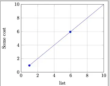
I want to plot as compact as possible using pgfplots.
I have the following piece of code:
\documentclass{standalone}
\usepackage{graphicx}
\usepackage{tikz}
\usepackage{pgfplots}
\begin{document}
\begin{tikzpicture}
    \begin{axis}
        [
            width=7.5cm,
            xlabel={Size of the data set list},
            ylabel={Gas cost},
            grid=major,
            domain=1:100,
            xmin=0,xmax=10,
            ymin=0,ymax=10,
            ytick={0,2,...,12},
            samples=21,
        ]
        \addplot {x};
    \end{axis}
\end{tikzpicture}
\end{document}
With the following output:
I don't know why but there is extra new-line between the y-axis's label and its line. How can I remove the extra-space between y-axis's label and y-axis line?


pgfplotsversion 1.18). You can definey label stylewith smallerinner sep, for exampleinner sep=1pt. – Zarko Apr 15 '22 at 12:57\pgfplotsset{compat = newest}should I use1.3instead ofnewest– alper Apr 15 '22 at 13:19compatwith a version number higher than 1.3 will improve the position of the y-axis label. I would probably use the setting corresponding to thepgfplotsversion you have installed, so if you're up to date, that iscompat=1.18. (By the way,latestisn't a valid option forcompat. There is anewestoption, but it is not recommended to use that: https://tex.stackexchange.com/q/139690/) – Torbjørn T. Apr 15 '22 at 13:28pgfplotsisv1.18.1, hencecompat=1.18is used. But still the extra space remains :-( – alper Apr 15 '22 at 16:28\pgfplotsset{compat=1.18}in your document. – Torbjørn T. Apr 15 '22 at 18:14