1

I have a few issues with getting a pgfplot right. I do not have much experience with pgfplots and neither online tutorials nor the pgfplots manuel could help me. The plot I want to create is a bar chart with three different plots. The first plot shall only have a y value for x = 1, the other two only for 2 <= x <= 32. My current tex code (with dummy y values) is the following:

\begin{tikzpicture}
    \begin{axis}[
            xlabel=x,
            ylabel=y,
            symbolic x coords={1,2,4,8,16,32},
            xtick=data,
            enlargelimits=0.05,
            legend pos=north east,
            ybar interval=0.7,
            ymajorgrids=true,
            y grid style=dashed,
        ]
    % A
    \addplot coordinates {
        (1,6)
    };

    % B
    \addplot coordinates {
        (2,5) (4,4) (8,3) (16,2) (32,1)
    };

    % C
    \addplot coordinates {
        (2,5) (4,4) (8,3) (16,2) (32,1)
    };

    \legend{A,B,C}
\end{axis}

\end{tikzpicture}

This code produces a plot that looks like this: Plot

Now, there are a few issues with this plot which I do not know how to fix.

  1. No values are visible on the x axis
  2. The 'A' plot is not visible
  3. The plots for x = 32 are missing completely

Thank you very much for your help in advance!
1 Answers1

1

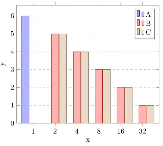
Most of these are linked to your choice of using ybar interval instead of ybar, which is what you should have used. The purpose of the interval type bar plots is that the coordinates define both the width and the height of the bars. If you have two coordinates (1,5)(3,2), you get one bar, of width 2 and height 5. See the pgfplots manual for more details.

This clearly isn't what you want to do, and hence, the first thing to do is change ybar interval to ybar.

In addition, note that xtick=data only takes the first \addplot into account, and in your case the first plot only has one x-value, and you'll get a tick only at the first group of bars. So remove xtick=data.

enter image description here

\documentclass[border=0.2cm]{standalone}
\usepackage{pgfplots}
\pgfplotsset{compat=1.18}
\begin{document}
 \begin{tikzpicture}
    \begin{axis}[
            xlabel=x,
            ylabel=y,
            symbolic x coords={1,2,4,8,16,32},
            ytick distance=1, % <-- added
            enlarge x limits={0.15}, % <-- increased value
            legend pos=north east,
            ybar=0.7, % <-- no interval
            ymajorgrids=true,
            y grid style=dashed,
            ymin=0
        ]
    % A
    \addplot coordinates {
        (1,6)
    };

    % B
    \addplot coordinates {
        (2,5) (4,4) (8,3) (16,2) (32,1)
    };

    % C
    \addplot coordinates {
        (2,5) (4,4) (8,3) (16,2) (32,1)
    };

    \legend{A,B,C}
\end{axis}

\end{tikzpicture} \end{document}

Torbjørn T.
  • 206,688
  • Thank you, that did the trick! One last thing which can also be seen in your image: The bars look a bit off, as (i believe) there exist an "invisible" bar for every plot at every x value. Do you know how one could center the existing bars for one x value around the tick? – Roysten R. Sep 13 '21 at 16:12
  • 1
    @TimonP That is correct, pgfplots counts the number of \addplots, and makes room for that number of bars at each coordinate. There is one method shown in https://tex.stackexchange.com/questions/43832/how-can-i-create-bar-plot-groups-of-different-sizes-in-pgfplots – Torbjørn T. Sep 13 '21 at 16:17