2

I couldn't understand how to style additional grid lines added with extra y tick style.

Perhaps I am missing something. Here it is explained how to draw grid lines only at specified positions, and this answer actually explains it, but nothing is rendered in my current code.

The MWE is the following:

\begin{filecontents*}{data.csv}
t,ch1,ch2,ch3
-4,-2,0.0625,0.756
-3,-1.5,0.125,-0.141
-2,-1,0.25,-0.909
-1,-0.5,0.5,-0.841
0,0,1,0
1,0.5,2,0.841
2,1,4,0.909
3,1.5,8,0.141
4,2,16,-0.758
\end{filecontents*}

\documentclass[border=5mm]{standalone} \usepackage{pgfplots,siunitx} \pgfplotsset{compat=newest} \begin{document} \begin{tikzpicture} \pgfplotsset{ ymin=-4, ymax=17 } %% ch2 plot \begin{axis}[ scale only axis, axis y line=left, axis x line=bottom, xlabel={Time [\si{s}]}, ylabel={Current [\si{\A}]}, grid=major ] \addplot [green] table[x=t,y=ch2,col sep=comma] {data.csv}; \end{axis}

%% ch3 plot \begin{axis}[ scale only axis, axis y line=right, axis x line=bottom, xtick=\empty, ylabel={Voltage (Normalised)}, ylabel style={red}, extra y ticks={-1,1}, %% <-- Here starts the confusion extra y tick labels={-3,5}, extra y tick style={ grid=major, }, ] \addplot [red] table[x=t,y=ch3,col sep=comma] {data.csv}; \end{axis}

\end{tikzpicture} \end{document}

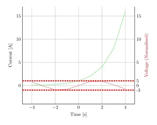
So I succeeded drawing grid lines at y=-1 and y=+1, with labels -3 and 5 respectively, but now I want to style it in red, with line width=2pt, and "densely dashed".

How to do it?

I tried also this:

extra y tick style={y tick label style={draw=red}}

But the output is now a red frame around the extra labels.

And this

extra y tick style={y tick label style={line width=2pt}}

doesn't plot any extra grid lines.

Any help?
tush
  • 1,115
  • 1
    Have a look here (https://tex.stackexchange.com/questions/122751/change-color-of-extra-ticks-grid), this should help you – Excelsior Apr 16 '21 at 17:47

1 Answers1

4

Like mentioned in the comments, this question deals with your topic.

You can specify the style of the mayor grid lines of the extra ticks using major grid style={...} in the extra y tick style environment.

enter image description here

\begin{filecontents*}{data.csv}
    t,ch1,ch2,ch3
    -4,-2,0.0625,0.756
    -3,-1.5,0.125,-0.141
    -2,-1,0.25,-0.909
    -1,-0.5,0.5,-0.841
    0,0,1,0
    1,0.5,2,0.841
    2,1,4,0.909
    3,1.5,8,0.141
    4,2,16,-0.758
\end{filecontents*}

\documentclass[border=5mm]{standalone} \usepackage{pgfplots,siunitx} \pgfplotsset{compat=newest} \begin{document} \begin{tikzpicture} \pgfplotsset{ ymin=-4, ymax=17 } %% ch2 plot \begin{axis}[ scale only axis, axis y line=left, axis x line=bottom, xlabel={Time [\si{s}]}, ylabel={Current [\si{\A}]}, grid=major ] \addplot [green] table[x=t,y=ch2,col sep=comma] {data.csv}; \end{axis}

    %% ch3 plot
    \begin{axis}[
        scale only axis,
        axis y line*=right,
        axis x line*=bottom,
        xtick=\empty,
        ylabel={Voltage (Normalised)},
        ylabel style={red},
        extra y ticks={-1,1},   %% &lt;-- Here starts the confusion
        extra y tick labels={-3,5},
        extra y tick style={
            grid=major,
            major grid style={red, line width=2pt, densely dashed}, % &lt;- this solves your problem
        },
        ]
        \addplot [red] table[x=t,y=ch3,col sep=comma] {data.csv};
    \end{axis}

\end{tikzpicture}

\end{document}

Excelsior
  • 2,322