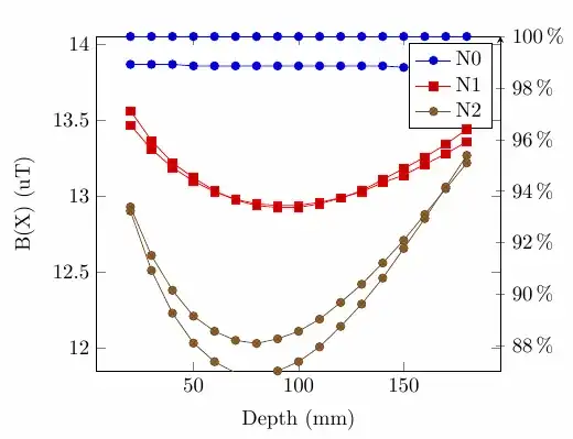
I am plotting some data where I am comparing the N1 and N2 cases to the N0 case. I want to show how much the N1 and N2 case have reduced compared to the N0 case as a percentage, and also show the raw data.
I have a minimum worked example below
\documentclass{article}
%\usepackage[utf8]{inputenc}
%\usepackage{tikz}
\usepackage{pgfplots}
\usepackage{pgfplotstable}

% N0 Percentage = (N0 / N0) * 100
% N1 Percentage = (N1 / N0) * 100
% N2 Percentage = (N2 / N0) * 100
\begin{filecontents*}{data.csv}
Depth,N0   ,N1     ,N2   ,N0 Percentage,N1 Percentage,N2 Percentage
20   ,13.87,13.47  ,12.93,100          ,97.11607787  ,93.22278298
30   ,13.87,13.31  ,12.61,100          ,95.96250901  ,90.91564528
40   ,13.87,13.19  ,12.38,100          ,95.09733237  ,89.25739005
50   ,13.86,13.1   ,12.21,100          ,94.51659452  ,88.0952381
60   ,13.86,13.03  ,12.11,100          ,94.01154401  ,87.37373737
70   ,13.86,12.98  ,12.05,100          ,93.65079365  ,86.94083694
80   ,13.86,12.95  ,12.03,100          ,93.43434343  ,86.7965368
90   ,13.86,12.9399,12.06,100          ,93.36147186  ,87.01298701
100  ,13.86,12.94  ,12.11,100          ,93.36219336  ,87.37373737
110  ,13.86,12.96  ,12.19,100          ,93.50649351  ,87.95093795
120  ,13.86,12.99  ,12.3 ,100          ,93.72294372  ,88.74458874
130  ,13.86,13.03  ,12.42,100          ,94.01154401  ,89.61038961
140  ,13.86,13.09  ,12.56,100          ,94.44444444  ,90.62049062
150  ,13.85,13.14  ,12.71,100          ,94.87364621  ,91.76895307
160  ,13.86,13.21  ,12.88,100          ,95.31024531  ,92.92929293
170  ,13.86,13.28  ,13.05,100          ,95.81529582  ,94.15584416
180  ,13.86,13.36  ,13.22,100          ,96.39249639  ,95.38239538
\end{filecontents*}

\begin{document}
\begin{tikzpicture}
    \pgfplotstableset{
      col sep=comma,
      trim cells,
    }
    \pgfplotstableread{data.csv}{\Data}
    %\pgfplotstabletypeset{\Data}

    \begin{axis}[
        ylabel = B(X) (uT),
        xlabel = Depth (mm),
    ]
        \addplot table [x = Depth, y = N0] {\Data}; \label{N0}; \addlegendentry{N0}
        \addplot table [x = Depth, y = N1] {\Data}; \label{N1}; \addlegendentry{N1}
        \addplot table [x = Depth, y = N2] {\Data}; \label{N2}; \addlegendentry{N2}
    \end{axis}


    \begin{axis}[
        axis y line=right,
        xticklabels={},
        xlabel={},
        yticklabel={\pgfmathprintnumber\tick\,\%},
        ymax = 100,
        ymin = 87,
    ]
        \addplot table [x = Depth, y = N0 Percentage] {\Data};
        \addplot table [x = Depth, y = N1 Percentage] {\Data};
        \addplot table [x = Depth, y = N2 Percentage] {\Data};
    \end{axis}

\end{tikzpicture}
\end{document}
The percentage version and the raw data version should completely overlap. The only addition should be the axis on the right hand side. I've found what the percentages are by precomputing them in excel (as N1/N0*100 and N2/N0*100) and including them in the .csv, as N0, N1 and N2 percentages, however, ideally I would like to be able to programmatically produce the right hand side Y axis and have the plots perfectly aligned automatically.
Here is the source image I'm trying to duplicate (was made in matplotlib).

The data is the same, but in python I was able to plot the percentage reduction lines as a horizontal dashed line (here shown as "-10 %"), which gave a good indication.
This will ultimately be part of a groupplot, looking something like this (this plot is the upper left corner):


