As mentioned in the comments, microtype is your friend here, and produces nicer output for the rest of the document as well.
Because all of these options depend on your reference list/reference style/margin settings/font choices (which we do not have), I've listed a few options and compared them using a sample text (\lipsum) and sample reference list biblatex-examples.bib which should be included on any system with biblatex installed.
In addition to microtype, I'd recommend a setting for biblatex's block= option. cgnieder suggested block=ragged, but I think this will be not acceptable for you given the update to your question. I've included it for future visitors, though. :-)
I think block=space would look closer to your ideal output. It allows extra space to be inserted between "blocks" in the bibliography, which can alleviate would-be line-breaking problems.
Another option could be \RaggedRight from ragged2e, which enables hyphenation without full justification, but this didn't look the greatest either considering your dissatisfaction with the block=ragged option. But again, this is highly dependent on the text/font/margins, so I've included it as an option for future visitors to try.
MWE
Here's the base test MWE I used to compare the settings:
\documentclass[draft]{memoir} % `draft' to show overfull \hboxes
\usepackage{lipsum}
%\usepackage{ragged2e}
\usepackage[final]{microtype} % `final' to prevent disabling
\usepackage[
  backend=biber, % default, but avoids warnings
  block=space,   % allow additional horizontal space between blocks
%  block=ragged,  % set the bibliography ragged right and introduce a line break penalty
]{biblatex}
\addbibresource{biblatex-examples.bib} % bunch of sample entries

\begin{document}
\lipsum    % print the sample text
\nocite{*} % print all references in the bibliography

%\raggedright
%\Raggedright
\printbibliography
\end{document}
Spoiler alert: the "best" (IMHO and for my test input/references) combination is shown in the sample above.
Comparison
I've left out anything that's "too ragged" (except for the default result) based on your update above. From "worst" to "best":
- Default configuration; no
\raggedright, no \RaggedRight, no microtype, default block=none: 14 bad boxes, worst 26.46pt too wide

- Add
microtype with default settings: 4 bad boxes, worst 8.09pt too wide
- Add
block=space in addition to microtype: 1 bad box, 1.12pt too wide

I've shown the worst offender in the screenshots, but line breaks around long DOI/URL-like strings were also vastly improved. Two examples:
Before:

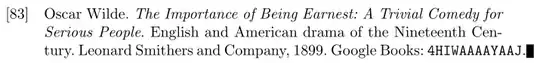 After:


Notes
If for some reason you really want microtype enabled only in the bibliography (though I'd recommend to just use it throughout the document), you can use \microtypesetup{disable} and \microtypesetup{enable} at the appropriate places in your document, as detailed in this answer. These keys are still undocumented, but you can find the code in lines 4118–4128 of the current (v2.5a) package code (p. 125 of the v2.5a documentation).


DOIandISBNnumbers on a line of their own? – Bernard Aug 11 '14 at 18:15\sloppy, go\raggedrightor allow linebreaks inside DOI. – yo' Aug 11 '14 at 18:16biblatexoptionblock=raggeddoesn't look too bad IMHO – cgnieder Aug 11 '14 at 18:28urlpackage docs should be followed: no breaking at-and no breaking inside alphanumerical sequences. This need not be enough. – yo' Aug 11 '14 at 18:31\usepackage{microtype}? It's a must-have in these borderline cases. – yo' Aug 11 '14 at 18:32microtypeafter all font packages. – yo' Aug 11 '14 at 18:56\begingroup \setlength{\emergencystretch}{4em} \printbibliography \endgroup. Credits to egreg (I think!). – sudosensei Aug 12 '14 at 00:13\raggedrightdoesn't look quite as nice, paradoxically, it is much easier to read. – Aug 12 '14 at 00:30block=raggedoption avoids overflows, but also omits the text justification« – Well, of course! If the block is ragged it isn't justified. Those two contradict each other! – cgnieder Aug 15 '14 at 16:22