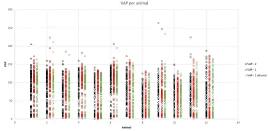
I have some data from three different machines and want to have a scatter plot with the points for each showing per animal that they were taken from. I have been using plot() for the first set and then points() to add the other two. The data is too close to see with them stacked on top of each other even with different colors or transparency. Is there a way to slightly shift the data plotted via points() to the right so that they are all visible for each animal?
Asked
Active
Viewed 924 times
3
-
Can you post your data, or a small example dataset? What exactly do you want to plot to show. The important feature might be that all animals give data so similar that the animals cannot be distinguished. – Aug 30 '19 at 18:00
-
Just add a small offset to the x coordinate corresponding to the legend categories. This is even fast and straightforward to do in Excel. – Sep 03 '19 at 15:11
1 Answers
4
The jitter command in R usually takes care of it pretty well.
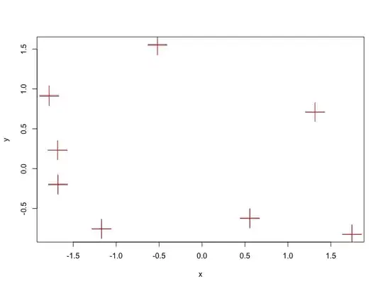
The following quick example shows how to do it:
x = rnorm(8)
y = rnorm(8)

plot(x,y, pch=3, cex=4)
points(jitter(x), jitter(y) ,col='red', pch=3, cex=4)
Which results in something like this
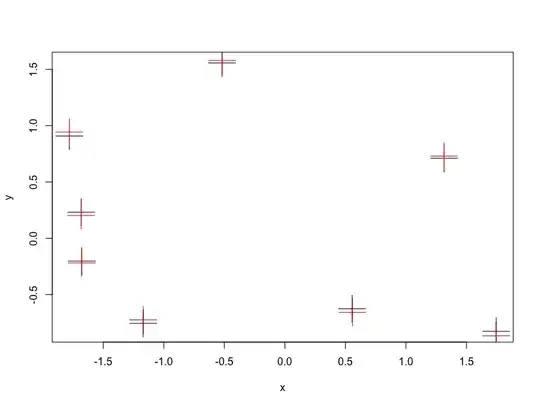
If you want to add more distance/noise, then use the factor parameter in the jitter function
plot(x,y, pch=3, cex=4)
points(jitter(x, factor=3), jitter(y, factor=3) ,col='red', pch=3, cex=4)
- Note, if you want to just shift them to the left/right, just add the jitter to the x values and not the y values.
-
1
-
Thanks, part of worked alright but not quite how I wanted it. When I did this in R, the data that I wanted in the lines above, but it is instead moving them both left and right from that central point. I just edited the post with a graph that I made in excel, but that took a long time to make, so I wanted to do it in R. – Sep 03 '19 at 14:19


