I have a question about Maximum Likelihood values, and how to interpret them.
In order to explain the question, please see the Figure below. I will add explanation for how this figure has been created at the end of this question.
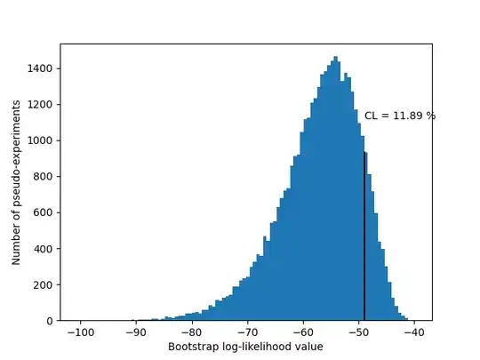
From the figure it can be see that the value obtained from the Maximum Likelihood Estimation between model and data was approximatly -49, as shown by the black line. This is a log-likelihood value obtained from a MLE between data and model.
The rest of the entries in the histogram are obtained from a bootstrap procedure, where the data was randomly sampled with replacement.
The Confidence Level (which I may have calculated the wrong way round to as would be traditional) is approximatly 12 %. This means that approximatly 12 % of the pseudo-experiments returned better fits, and 88 % returned worse fits.
My question is, now that I have obtained this figure, how should I interpret it?
It is unlikely that a random bootstrap sample provides a better fit between model and data. Approximatly 9/10 random bootstrap samples produce a worse fit between model and data, because the LL value is more negative in these cases.
Beyond that, I don't know what can be interpreted from this. This figure doesn't seem to express much in the way of a "good" vs "poor" fit. It might be that I just don't fully understand how to draw such a conclusion.
If this set of data is better than 90 % (ish) of random bootstrap samples, that seems to suggest the fit might be quite good?
I do not yet have plots of the distribution of model parameters. Perhaps the fact that I am missing these figures is partly why I cannot draw much in conclusion from this figure alone?
Figure Explanation:
The above figure shows a distribution of Likelihood Values generated in a numerical experiment. (Actually they are log-likelihood values but it is easy to convert between the two.)
The black line represents the result of a Maximum Likelihood estimation between a set of data and a model function. The log-likelihood value obtained was approximatly -49.
The remainder of the data in the histogram were obtained by creating a bootstrap sample from the data, and performing the MLE procedure repeatedly, measuring the obtained LL value each time. There are about 40,000 numerical experiments represented in the histogram in the figure.


