am looking for some advice with some modelling work I'm doing. My data is proportion data which is known to be positively skewed and not normally distributed - histogram below.

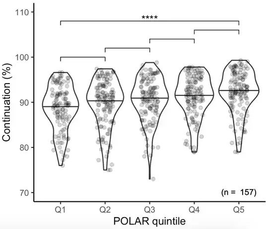
I want to determine the effect of a quintile based metric on this outcome - I know from descriptive plots that it is likely there is a significant effect (see Fig below).

I'm trying to fit a general linear mixed effect model using lme4 package in R with the following structure. There is pseudoreplication in the dataset at the level of PROVIDER_NAME and YEAR, hence introducing those as random effects.
cont_polar_mod_3 <-glmer(data=ofs2_cont_polar, cbind(Outcome_NUMERATOR, Outcome_DENOMINATOR) ~ QUINTILE + (1 | PROVIDER_NAME) + (1 | YEAR), family=binomial)
However, when I inspect the model using DHARMa, I am unconvinced that I am using the right model structure, as the QQ-plot is a long way off a straight line. The data looks under-dispersed to me, but I'm not entirely sure whether this is relevant for the model structure I am using - think it matters for binomial but not for gaussian (might be wrong here)?
Can anyone advise what I should do? Is it safe to use the model as it is even though the QQplot looks bad, or do I need another structure? For reference I've tried adding with and without an observation level effect term, and have tried using both a calculated proportion column and cbind column as my response variable. I've also tried log transforming the response variable. None of which changes the QQplot very much.
With thanks in advance, Katharine
[Update 1] - Apologies, realise I set up my cbind column incorrectly. Have now set it up as cbind(success, failure) not cbind(success, total) and get the following plots in DHARMa which look better?
[Update 2] Have now tried modelling with a beta distribution as per @ShawnHemelstrand suggestion, with the revised cbind column. This looks better?


