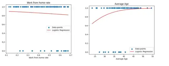
I tried to create a logistic regression model and then plot it, the first try didn't really work out and I got something like this:
However then I realized that my data is imbalanced (around 85% are 1s a the rest are 0s), so I changed my model to have a weighted logistic regression in Python using sklearn:
clf = LogisticRegression(class_weight='balanced')
for some of the data this worked perfectly, as seen in the Average age chart, however, some are still not 'curvy' and are missing the sigmoid look (in terms of Work from home, negative sigmoid look).
Furthermore, when I test my model, for some I get a pretty good accuracy of 80%+, but some are between 40-50 and just by looking at the visualisation it impossible to understand what is going on.


splines2." – Sycorax Jan 24 '23 at 16:29