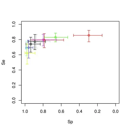
I have pairs of intervals, where each pair has an interval corresponding to treatment
and then treatment .
If the intervals corresponding to the two treaments are completely independent, then a cross-hair plot like you show is a simple and reasonable way to display the intervals. The drawback is that they don't represent anything related to the distribution of values or model estimates along each cross-hair, just the values at the pre-specified interval limits.
If you do have more information about the distribution of values or estimates along the intervals, then you might consider shading, color coding, or additional cross-hatch marks along each cross-hair to display that aspect of the data.
Shading or coloring would be particularly useful if the responses to the two treatments were themselves paired within each pair of intervals: for example, if each pair of intervals represents responses by a group of individuals each of whom received both treatments. Then you would have correlated estimates of the joint responses to the treatments within each pair of intervals, which could be displayed in a set of 2D contour or density plots.
