Normal QQ Plots
Without knowing much about the data you have, I would definitely say that this QQ plot shows the assumption of normality has not been met. The entire shape of the plot looks curved and a large majority of points are falling off the line. I will show some examples of QQ plots below to give you an idea of what they should and shouldn't look like. Remember that a QQ plot is supposed to approximate the theoretical distribution of values, so it is not perfect, but nonetheless provides a good quick check of our regression assumptions.
First, here is a QQ plot of the classic Pearson data on father-son heights, which I have loaded into R.
#### Load and Fit Pearson Data ####
library(UsingR)
fit <- lm(sheight ~ fheight,
          father.son)
plot(fit)
You can see here that several of the points sit on the line, with a fair amount curling at the far ends (which is fairly normal given how much data we have from Pearson). We could possibly deduce that this is a heavy-tailed QQ plot, and that it has some inaccuracy at prediction, but we can't know for certain without checking further.
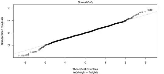
As a result, you should almost always check your scatterplot of the data to see why. Typically, QQ plots look weird when regression lines are curvilinear, the distribution of values is sporadic, or the regression in general has some specific inaccuracy in measurement. Here, we can see the reason for the curling of the QQ plot. The regression line fits the data pretty well, but the lowest and highest values in the scatter plot are more sparse and there are some data points above and below the regression line that are also less common. You can see for example that point 1073 was labelled in the QQ plot, which is one of the values sitting below the large bubble of points in this scatterplot (labeled in yellow). Here, the regression line over-predicted by a lot, as this data point has a son height that is quite low compared to the others at this value of father heights:

Looking at the data, we can see it is fairly linear, has mostly equality of variance, and to our knowledge no confounding issues with clustered data. So we can say the QQ plot is okay and our regression is safe (barring some caveats we would discuss about points like 1073).
Problematic QQ Plots
I will now create a curvilinear distribution of values and plot them.
#### Create Estimated Y Dependent on X ####
y.hat <- function(x){
  y <- -x^2
  return(y)
}
Make Random 1000 Values of X
x <- rnorm(n=1000)
Convert X Values to Their Y Value
y <- y.hat(x)
Add to Data Frame
df <- data.frame(x,y)
Plot
plot(x,y)
Which you can see here is probably going to have issues:

Fitting the values with a standard regression and plotting the qq plot:
#### Fit and Plot ####
bad.fit <- lm(y ~ x, df)
plot(bad.fit)
You can see the QQ plot now looks a lot like yours:

Given we didn't meet the linearity assumption and the QQ plot is clearly off, we would need to refit this data, as its ability to predict is likely pretty awful.
As a final note: always check everything in your data when this happens. There could be any number of things going on...independence violations, inequality of variance, etc. Its best to get a complete picture rather than the QQ plot alone. The answer here also does a good job of documenting why QQ plots look the way they do. This resource is also useful.


