6

I am trying to calculate whether the difference between the two benchmarks is statically different or not.

The input is req/sec of a HTTP Server and I'm using scipy.stats.ttest_ind to calculate the p-value.

A1 = [
  4670, 4646, 4612, 4618, 4646,
  4609, 4623, 4629, 4566, 4628,
  4582, 4636, 4621, 4574, 4624,
  4563, 4651, 4642, 4586, 4621,
  4606, 4628, 4575, 4631, 4646,
  4600, 4594, 4661, 4568, 4611
]

B1 = [ 4630, 4655, 4652, 4633, 4637, 4661, 4625, 4680, 4647, 4639, 4633, 4661, 4638, 4621, 4630, 4682, 4703, 4665, 4652, 4648, 4673, 4651, 4669, 4646, 4612, 4654, 4651, 4619, 4637, 4620 ] st.ttest_ind(A1, B1)

Ttest_indResult(statistic=-4.855056212284194, pvalue=9.47100493260572e-06)

Why the value is 9.47100493260572e-06? I was expecting to see a value bigger than 0.05 because the input is pretty similar and the means are relatively close, too: 4615 vs 4647

Am I missing something?

Dave
  • 62,186
Rafael
  • 65
  • The question omits details about the domain and the problem at hand, so it's hard to consider whether a t-test is a great choice. It might be interesting to read about equivalence testing. – dipetkov Nov 06 '22 at 15:57
  • 1
    Change the origin of your units to 4600 and look again at the data. Plotting the distributions of the two groups would be a good idea. – whuber Apr 04 '23 at 17:32

3 Answers3

15

The t-test does not care about the magnitudes of your values. The t-test concerns itself with their variance. You are correct that your numbers look to be roughly aligned. However, the distributions appear to be rather tightly clustered, meaning low enough variance for the difference in means to be statistically significant.

What you’re allowed to do is ignore the statistical significance and decide that the means are close enough together, based on your knowledge of the process under study, that you accept this difference. This gets into practical significance, as opposed to statistical significance.

Dave
  • 62,186
  • Thanks, that was enlightening. However, trusting the mean between results, specifically on HTTP Benchmarks, is not reliable considering the fact of outliers.

    I am trying to use the student t-test approach to compare performance optimizations between two branches. Is there a better approach to use? Thanks in advance

    – Rafael Nov 06 '22 at 01:03
  • 5
    @RafaelGonzaga Then why are you hypothesis testing the means? You might consider posting a new question where you explain your data and goals in more detail, as the specifics of those really are not pertinent to the question asked here. – Dave Nov 06 '22 at 01:05
  • You right. Thanks! – Rafael Nov 06 '22 at 01:17
  • It is really correct to say that "the t-test concerns itself with (...) variance"? – dipetkov Nov 06 '22 at 15:41
  • @dipetkov How do you figure it doesn’t concern itself with variance? – Dave Nov 06 '22 at 15:43
  • I just think it's poor phrasing. The way I understand it is that the objective of t-test is actually the location and the scale is a nuisance parameter. – dipetkov Nov 06 '22 at 15:48
  • 2
    My point was that the test doesn’t care about raw magnitudes, just how spread out the groups are from their means. I’ll think about how to edit in an improved phrasing, bearing in mind that the OP found the original post to be helpful. – Dave Nov 06 '22 at 15:49
  • Yes, of course you are right that the t-statistics is normalized for the standard deviation, or an estimate of it at least. – dipetkov Nov 06 '22 at 15:51
  • @Rafael Outliers will normally affect the power of a t-test more than the level, meaning that if you get significance despite the outliers, chances are you will also get significance if you do something to deal with the outliers (like for example testing equality of medians). Ultimately a significance test (no matter which) may not be what you need here, for the reasons given in Dave's answer. – Christian Hennig Apr 05 '23 at 11:05
15

This is more of a comment or extension to the answer by @Dave. You should always plot your data, and could have included such a plot in your question. Below is plots that help to show the difference between the groups. I use R for the plots, at the end I give the code used.

enter image description here

This is simply a boxplot with the individual points overplotted. Alternatively, we can show histograms:

enter image description here

The R code used is:

A1 <- c(
  4670, 4646, 4612, 4618, 4646,
  4609, 4623, 4629, 4566, 4628,
  4582, 4636, 4621, 4574, 4624,
  4563, 4651, 4642, 4586, 4621,
  4606, 4628, 4575, 4631, 4646,
  4600, 4594, 4661, 4568, 4611
)

B1 <- c( 4630, 4655, 4652, 4633, 4637, 4661, 4625, 4680, 4647, 4639, 4633, 4661, 4638, 4621, 4630, 4682, 4703, 4665, 4652, 4648, 4673, 4651, 4669, 4646, 4612, 4654, 4651, 4619, 4637, 4620 ) library(ggplot2) library(hrbrthemes)

df <- data.frame( req = c(A1, B1), benchmark=c(rep("A", length(A1)), rep("B", length(B1))) )

ggplot(df, aes(benchmark, req, color=benchmark)) + geom_boxplot() + geom_point()

Side-by-side histograms

ggplot(df,aes(req, ..density.., fill=benchmark)) + geom_histogram(color="#e9ecef",alpha=0.4, bins=10, position="identity") + theme_ipsum() + scale_fill_manual(values=c("#69b3a2", "#404080"))

  • Thanks for the explanation of the graphs. I came from a different area, therefore, some foundations are not very clear to me. It's not very clear to me to understand when should I use the t-test approach, should I create a new question? – Rafael Nov 06 '22 at 22:11
  • 2
    @Rafael The focus of the suggest is not shall I use a t-test?. Instead, it is a recommendation to visualize the data very early (as a tool complementary to e.g., a t-test) by an affordable plot. This could be: to recognize if a distribution might be normal, or skewed, or tailed, plot a histogram. For a relationship between dependent and independent variable perhaps linear, or exponential, or different, plot a scatter plot (Anscombe's quartet). And then engage with the computation(s), tests, modelization, plots for the final report. – Buttonwood Nov 07 '22 at 06:46
  • @Rafael Looking at this plot, the mean different between groups is very clear, and outliers are not an issue. So your test result is fine, what's wrong was your expectation what the result should be. – Christian Hennig Apr 05 '23 at 11:08
1

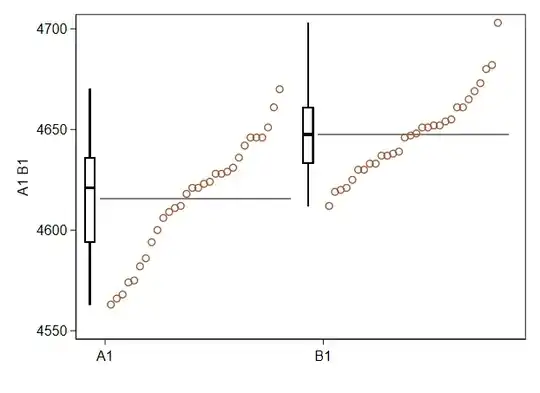
I strongly support the stance of @kjetil b halvorsen that visualization is the first priority. This would be a comment on his answer except that I have a different graph to show.

The spirit of plotting all the data, plus a summary, is excellent. Kjetil's graph in practice raises two comments on details.

  1. The plot doesn't show means. As it happens, the means are close to the medians, but you are not always so lucky.

  2. A dot plot or strip plot in a single line will not be easy to work with if there is much over=plotting of similar or identical values. Same comment: As it happens, that is not a major problem here, but you are not always so lucky.

This plot follows the spirit of Emanuel Parzen's suggestion that a quantile plot together with a box gives a good picture of the data.

The boxes conventionally show medians and quartiles. The quantile plos show the points in order with a tacit horizontal scale of rank or plotting position. So, outliers, gaps, tied values and other fine structure are all evident if they exist. The longer horizontal lines show the means. (Incidentally, each mean is also the area under the quantile function expressed as a continuous curve and as a function of cumulative probability.)

enter image description here

Nick Cox
  • 56,404
  • 8
  • 127
  • 185