3

Here is the plot ,which I do not know what type of plot it is.

My plot

It is so similar to box plot, but it does not have first quartile. How we can find mean and standard deviation using this plot?

UPDATE:

Link to the source:

https://www.frontiersin.org/articles/10.3389/fendo.2022.754401/full

Henry
  • 39,459
  • 1
    It's a bar plot. Usually, the bars show mean values and the error bars denote mean + 1 standard deviation but that's not sure. It could also be mean + 2 SD or + 1 standard error or + 2 SE or the upper limit of a confidence interval or even median + some quantile. It's good practice to define this in the figure caption. – Roland Oct 05 '22 at 07:00
  • @Roland doesn't mean median + some quantile literally: he means that each whisker may extend between a median and some quantile. – Nick Cox Oct 06 '22 at 10:41

2 Answers2

4

This is a vertical bar chart. The bars probably indicate averages within each group (and the numbers above each bar seem to give the same information).

The length of the whiskers usually gives the standard error of the mean (although it could also give the standard deviation - this should ideally be noted in the figure caption). If this is so, you can back-calculate the standard deviation by multiplying the length of the whisker by the square root of the group size. For instance, the whisker of the first bar looks like it is about 25% long, so the SD would be $25\times \sqrt{27}\%\approx 130\%$. Note that then the mean minus one SD would be negative, which may be meaningless. So keep the context in mind.

Stephan Kolassa
  • 123,354
  • Thank you, finally, Can we find exact value of mean and SD related to this plot using some specific softwares? – mohammad rezza Oct 05 '22 at 07:18
  • 2
    As long as you can only read off the whisker lengths from the graphic, it won't get any more precise than what I give in my answer. The bigger problem is that the figure caption does not note which of several conflicting conventions the authors followed in plotting their data, so there is really very little we can do. Your best bet is likely to contact the corresponding author and ask them directly. – Stephan Kolassa Oct 05 '22 at 07:22
  • 2
    The actual numbers are in https://www.frontiersin.org/files/Articles/754401/fendo-13-754401-HTML/image_m/fendo-13-754401-t003.jpg – Henry Oct 05 '22 at 08:56
4

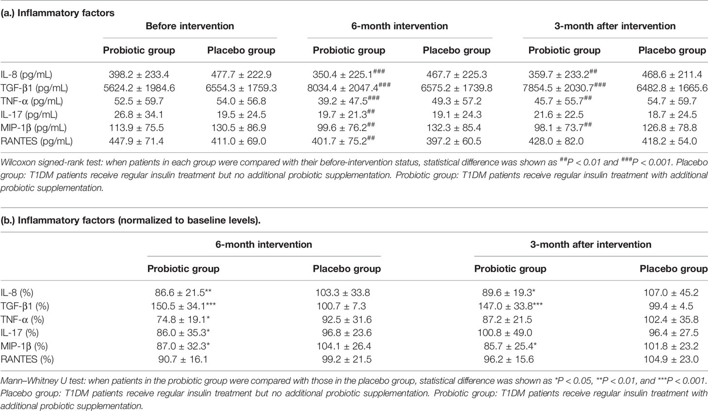
Table 3 of the document you took this from says the first bar is illustrating $86.6 \pm 21.5$, the second $103.3 \pm 33.8$, etc.

So you can read the estimate (presumably the mean) directly from the chart and this is height of the bar.

The length of the whisker is than in a sense the positive margin of error in some sense on top of this. While that number is not stated in the chart, it can be seen visually.

It is not immediately clear whether this margin is the standard error or about twice the standard error (for a $95\%$ confidence interval of a $t$ distribution with $27$ degrees of freedom about $\pm2.052 se$, for $29$ degrees of freedom about $\pm2.045 se$) but from the asterisks I would guess the latter. If this is what they have done, that could make the standard error for the first bar about $\frac{21.5}{2.052}\approx 10.5$ and the original sample standard deviation about $10.5\sqrt{27}\approx 54.5$.

What the numbers actually mean is another question. The $y$-axis label suggests this is the 6-month intervention number as a percentage of the pre-intervention number, so presumably $100$ would suggest no change.

Henry
  • 39,459