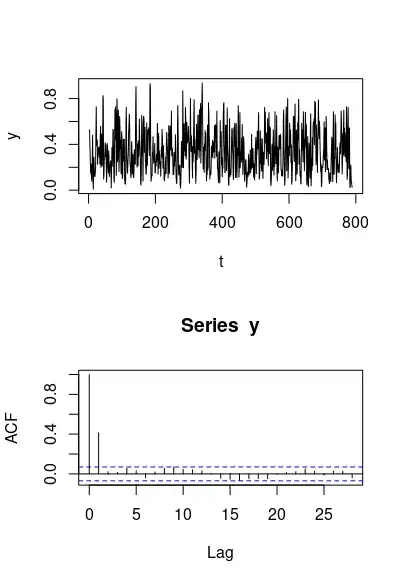
The below graph seems to be random but I think the peaks seem to repeat after a certain period. Are there any statistical tools I can use to analyze this?
-
Yes, an autocorrelation plot. – user2974951 May 10 '22 at 10:51
-
Can you elaborate, please? I can plot the autocorrelation using some inbuilt function in Matlab but what can I learn from it? Edit: I got a plot that looks like a symmetriacal triangle with double the size of initial array – aravinddvarma May 10 '22 at 10:55
-
Can you post the plot into your question? – user2974951 May 10 '22 at 10:59
-
I just did. The original array is 789 while the autocorrelation is its double. – aravinddvarma May 10 '22 at 11:12
-
2That's... not possible, autocorrelation is between 0 and 1, your plot goes to 150... – user2974951 May 10 '22 at 11:17
-
1Please explain how you made that new plot, it is not an autocorrelation plot. Please also give (a link to( your data, so we can have a look – kjetil b halvorsen May 10 '22 at 13:08
-
See https://stats.stackexchange.com/questions/81754 for an explanation of some of the subtleties of autocorrelation coefficient calculations. – whuber May 10 '22 at 15:43
-
I have used MATLAB's xcorr function. From the website: https://in.mathworks.com/help/matlab/ref/xcorr.html r = xcorr(x) returns the autocorrelation sequence of x – aravinddvarma May 11 '22 at 06:00
2 Answers
The plot that you made looks like using the function xcorr which computes an autocorrelation function without normalization.
$$R(l) = \sum_{\forall k:0\leq k \leq 800 \text{ and } 0\leq k+l \leq 800} R(k)\cdot R(k+l)$$
This is why you get this piramid shape. The number of terms in the sum changes/decline when the lag $l$ gets larger. This makes the sum become less.
If you normalize the function then you should get something like
This function can tell you whether there is a periodic behaviour. For instance there might be peaks repeating every 4 or 8/9 time points.
In my plot you see that the correlation is not very significant (the blue dotted lines point the boundary above/below which the correlations are significant). But, I sampled data from your image. If instead you do this with your raw data then the correlation might be stronger and the pattern could be more clear.
- 77,915
If you suspect that there are periodic signals in your data, you can analyse it in the frequency domain. I would recommend you start by plotting the signal intensity using the intensity function in the ts.extend package in R. Intensity spikes in the frequency domain indicate periodic signals in the data, and harmonics of these spikes occur when those periodic signals have a shape that is not perfectly sinusoidal.
- 124,856


