3

I have created a multivariate multiple regression model with 3 dependent and 3 independent variables in R, and would like to generate meaningful visualizations. All variables are continuous. When working with multiple regression models with 1 dependent variable, this is fairly easy.

For example

set.seed(0)

df <- data.frame(ind1 = c(1:10), ind2 = runif(10,5,15), ind3 = runif(10,5,15)) df$dep1 <- df$ind1 * df$ind2 * df$ind3 df$dep2 <- df$ind1 * df$ind2 * df$ind3 * runif(10) df$dep3 <- df$ind1 * df$ind2 * df$ind3 * abs(rnorm(10))

model1 <- lm(data = df, dep1 ~ ind1 + ind2 + ind3)

There are simple options for different insightful visualizations

library('ggplot2')
library('ggeffects')

ggplot(ggpredict(model1, terms = c("ind1 [1,5,10]", "ind2", "ind3")), aes(x, predicted, color = group)) + geom_line() + facet_wrap(~facet)

ggplot

library('car')
avPlots(model1)

avPlots

library('sjPlot')
plot_model(model1, type = 'diag')

Diagnostic plot 1 Diagnostic plot 2 Diagnostic plot 3 Diagnostic plot 4

However, in a model with 3 dependent variables

model2 <- lm(data = df, cbind(dep1, dep2, dep3) ~ ind1 + ind2 + ind3)

these options seem to go out the window. I am hoping to come up with something a little more powerful than simply

hist(resid(model2))

Let me know if this topic is a better fit for R StackOverflow.

  • 1
    Could you be a little more specific than "generate meaningful visualizations"? What aspect(s) of the regression do you wish to depict? – whuber Feb 23 '22 at 22:37
  • @whuber I am interested in both figures showing the nature of the variable relationships, as in my self-answer, as well as figures showing the statistical strength of the model. My goal is ease of interpretation, with more elegance than simply a table listing statistics – sethparker Feb 24 '22 at 18:48
  • Unfortunately, your answer is unclear because, to be understood, one must run the code. Including an image of the output would help. – whuber Feb 24 '22 at 19:04
  • @whuber I have edited the question to include data and plots. I will edit my answer shortly – sethparker Feb 24 '22 at 20:52
  • 1
    Usually with regression models, people are interested in how the conditional mean of Y changes with X. Is that what you're doing in your multivariate regression model? If so, why not just plot the mean of Y1 vs X, Y2 vs X, etc? Are you interested in changes in spread, or in the correlation between Y variables? Etc. Are you interested in assessing assumptions of the model? Something else? I agree w/ @whuber, that it's hard to say what visualization will be most meaningful without clearer goals. – gung - Reinstate Monica Feb 24 '22 at 21:00
  • @gung-ReinstateMonica I am interested in the conditional mean of Y as it changes with X, and will check out plotting as you described. The Y correlation is also of high interest. My Y data is rates at which a species dies by cause, my X is species traits that significantly predict death. There is not much on here or StackOverflow on so-called "standard" visualizations for this type of regression, so this post can be for discussion of methods – sethparker Feb 24 '22 at 21:18

3 Answers3

1

I think you might do best to review multivariate regression (meaning no disrespect). There is a short tutorial at UVA's stats help page here: https://data.library.virginia.edu/getting-started-with-multivariate-multiple-regression/. They explain that multivariate regression is mostly the same as several univariate regressions, except that there are covariances between the betas for the different outcomes that need to be taken into account when testing the variables. In particular, they mention that the relevant plots are the same:

The same diagnostics we check for models with one predictor should be checked for these as well.

I will use their example to illustrate some data visualizations below (coded in R). I'll start with a scatterplot matrix of the data. GEN is binary, so I'll represent that with a different color and symbol. After fitting the model, if you try to run plot.lm() you'll get an error. However, it's easy enough to reproduce those plots manually. To plot a multiple regression model without interactions, you can pick a variable of interest and make a scatterplot with it and the response and draw the fitted function over it. Be sure to adjust the intercept by setting other variables at their means (see my answer to How to visualize a fitted multiple regression model?). You can also make scatterplots and qq-plots of the residuals (the latter lets you assess if their distribution is similar).

ami_data = read.table("http://static.lib.virginia.edu/statlab/materials/data/ami_data.DAT")
names(ami_data) = c("TOT","AMI","GEN","AMT","PR","DIAP","QRS")

summary(ami_data)
# output omitted
pairs(ami_data[,-3], col=ifelse(ami_data$GEN, "red", "black"),
                     pch=ifelse(ami_data$GEN, 3, 1))
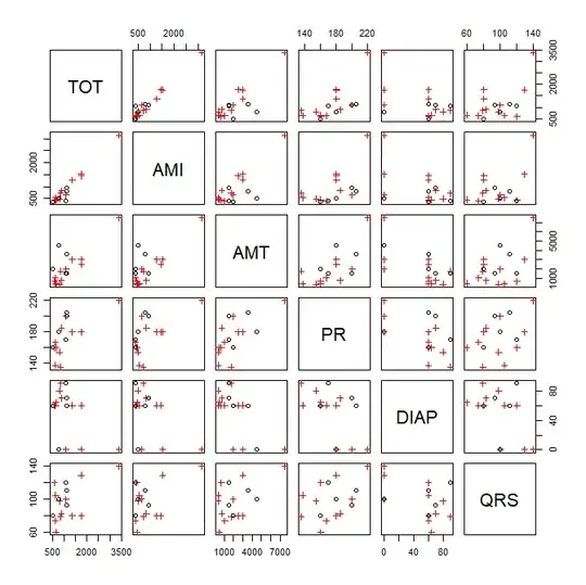
scatterplot matrix

mlm1 = lm(cbind(TOT, AMI) ~ GEN + AMT + PR + DIAP + QRS, data=ami_data)
summary(mlm1)
# output omitted
head(resid(mlm1))
#          TOT        AMI
# 1  132.82172  161.52769
# 2  -72.00392 -264.35329
# 3 -399.24769 -373.85244
# 4 -382.84730 -247.29456
# 5 -152.39129   15.78777
# 6  366.78644  217.13206
windows()
  plot(mlm1)
# Error: 'plot.mlm' is not implemented yet

reproducing R's plot.lm() for TOT

rst = rstandard(mlm1) # standardized residuals windows()
layout(matrix(1:4, nrow=2, byrow=T))

plot 1

plot(resid(mlm1)[,1]~fitted(mlm1)[,1], main="Residuals vs Fitted for TOT", xlab="fitted", ylab="residuals") lines(lowess(resid(mlm1)[,1]~fitted(mlm1)[,1]), col="red")

plot 2

plot(sqrt(abs(rst[,1]))~fitted(mlm1)[,1], main="Scale-Location plot for TOT", xlab="fitted", ylab="residuals") lines(lowess(sqrt(abs(rst[,1]))~fitted(mlm1)[,1]), col="red")

plot 3

qqnorm(rst[,1], main="qq-plot of residuals TOT") qqline(rst[,1])

plot 5

plot(rst[,1]~lm.influence(mlm1)$hat, xlab="Leverage", ylab="residuals", main="Residuals vs Leverage for TOT") lines(lowess(rst[,1]~lm.influence(mlm1)$hat), col="red")

diagnostic plots for tot

windows()  
  layout(matrix(1:4, nrow=2, byrow=T))
  # plot of model for TOT vs AMT
  plot(TOT~AMT, ami_data, main="TOT vs AMT w/ data & model", 
       col=ifelse(ami_data$GEN, 2, 1), pch=ifelse(ami_data$GEN, 3, 1))
  abline(coef(mlm1)[-3,1]%*%c(1, apply(ami_data[,c(3,5:7)], 2, mean)),
         coef(mlm1)[3,1], col="blue")
  # plot of model for AMI vs AMT
  plot(AMI~AMT, ami_data, main="AMI vs AMT w/ data & model", 
       col=ifelse(ami_data$GEN, 2, 1), pch=ifelse(ami_data$GEN, 3, 1))
  abline(coef(mlm1)[-3,2]%*%c(1, apply(ami_data[,c(3,5:7)], 2, mean)),
         coef(mlm1)[3,2], col="blue")
  # scatterplot of residuals
  plot(resid(mlm1)[,1], resid(mlm1)[,2], xlab="Residuals for TOT",
       ylab="Residuals for AMI", main="scatterplot of residuals")
  # qq-plot of residuals
  qqplot(resid(mlm1)[,1], resid(mlm1)[,2], xlab="Residuals for TOT",
         ylab="Residuals for AMI", main="qq-plot for residuals")

plots of model and residuals

0

One option is to create a 3D surface plot showing the sensitivity of your dependent variables to the independent variables in your model.

First, create sequences (length = 10 here) along your independent variables.

df2 <- data.frame(ind1 = seq(from = min(df$ind1), to = max(df$ind1), by = (max(df$ind1)-min(df$ind1))/9),
                  ind2 = seq(from = min(df$ind2), to = max(df$ind2), by = (max(df$ind2)-min(df$ind2))/9),
                  ind3 = seq(from = min(df$ind3), to = max(df$ind3), by = (max(df$ind3)-min(df$ind3))/9))

Next, generate a series of predictions.

tst <- predict(model2, df2)

Now, you can plot these predicted values of dep1,dep2,anddep3 as a 3D surface.

library('plotly')

generate a numeric matrix for use with plotly::plot_ly

mat <- matrix(ncol = ncol(tst), nrow = nrow(tst))

populate matrix with numeric values from model prediction

for (i in 1:3) { mat[,i] <- tst[,i] }

generate 3D surface

plot_ly(type = 'surface', z = mat) %>%

customize axis titles

layout(scene = list(xaxis = list(title = 'dep1'), yaxis = list(title = 'dep2'), zaxis = list(title = 'dep3')))

This creates an interactive plot. A still image is shown here plot

0

Hypothesis tests in multivariate multiple regression models can be visualized using hypothesis-error (HE) plots, implemented in the heplots package, https:friendly.github.io/heplots/

These show data ellipses for the residuals (E) in relation to the predictors (H). For 1 df regression terms, the H "ellipses" collapse to a line. They have the property that the H ellipse projects outside the E ellipse if and only if the term is significant by Roy's test.

For this example, we get:

library(heplots)
heplot(model2, fill=TRUE, fill.alpha=0.1)

enter image description here

Here, only ind1 is significant.

> car::Anova(model2, test="Roy")

Type II MANOVA Tests: Roy test statistic Df test stat approx F num Df den Df Pr(>F)
ind1 1 6.14 8.19 3 4 0.035 * ind2 1 1.43 1.91 3 4 0.270
ind3 1 1.45 1.94 3 4 0.265


Signif. codes: 0 '*' 0.001 '' 0.01 '*' 0.05 '.' 0.1 ' ' 1

A scatterplot matrix version is obtained using pairs.mlm

pairs(model2, , fill=TRUE, fill.alpha=0.1)

The angles of the H lines for the predictors ind1, ind2, and ind3 wrt the dep variables show the correlations of the former with the latter. enter image description here

For more complex models, involving factors (df > 1 terms), these results can be visualized in "canonical space" using the candisc package, candisc