Box and whisker plot 3D doughnut plot Heatmap depicting expression levels Line plot Column scatterplot
1 Answers
Some graphical methods don't work well for really small samples (for example boxplots and histograms).
But for moderately large samples, most methods work well. Then the choice of method is determined according to which one shows what you want to say about the data.
Perhaps you want to show that data are bimodal. Then a histogram may be better than a boxplot.
set.seed(2020)
x = c(rnorm(100, 80, 20), rnorm(150, 150, 10))
par(mfrow=c(1,2))
 hist(x, prob=T, col="skyblue2")
 boxplot(x, col="skyblue2", pch=19)
par(mfrow=c(1,1))
If showing extreme skewness or frequent outliers in one tail, then a boxplot may be better than a histogram.
set.seed(402)
x = rexp(400, .01)
par(mfrow=c(2,1))
 boxplot(x, horizontal=T, col="skyblue2", pch=19)
 hist(x, prob=T, col="skyblue2")
par(mfrow=c(1,1))
If two variables are highly correlated then a scatterplot may be more interesting than side-by-side boxplots.
set.seed(1234)
x = rnorm(300, 100, 10)
y = x + rnorm(300, 0, 3)
par(mfrow=c(1,2))
 plot(x,y, pch=20)
 boxplot(x,y, col="skyblue2", pch=10)
par(mfrow=c(1,1))
However, if two independent samples have different centers, a scatterplot may
not be interesting, and a comparison of boxplots or a comparison of plots of empirical CDFs may tell the story. Either way, it is clear that xs tend to be larger than ys.
set.seed(1066)
x = rgamma(100, 6, .1)
y = rgamma(150, 5, .1)
par(mfrow=c(1,2))
 boxplot(x, y, col=c("skyblue2","tan"), pch=19)
 plot(ecdf(x), col="blue")
  lines(ecdf(y), col="brown")
par(mfrow=c(1,1))
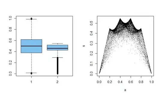
Sometimes you don't know until you make some plots which one will be the most interesting. Here we have sample means and standard deviations of samples of size 5 from $\mathsf{Beta}(.1, .1).$ For such data $\bar X$ and $S$ are uncorrelated, but not independent.
set.seed(1492)
x = rbeta(30000 * 5, .1, .1)
DTA=matrix(x, nrow=30000)
a = rowMeans(DTA)
s = apply(DTA, 1, sd)
par(mfrow = c(1,2))
 boxplot(a, s, col="skyblue2")
 plot(a,s, pch=".")
par(mfrow=c(1,1))
- 56,185
-
1(+1) Helpful, detailed and thorough as always. But I don't understand the enthusiasm for ECDF plots over quantile plots (and an answer that they show the same information with axes exchanged doesn't explain why ECDF plots are better). On a quantile plot (here a plot of values on vertical axis versus rank or cumulative probability) it seems to me easier to see what is going on in the tails, which is often my top priority. – Nick Cox Oct 04 '20 at 09:29
-
Here the ECDF plots show that the 'blue' sample' stochastically dominates the 'brown' one. I agree that quantile plots are usually best for judging normality. Perhaps ECDF plots are useful after doing a two-sample Wilcoxon tests on samples of different shape where it's clear something other than a difference in medians is at stake. – BruceET Oct 04 '20 at 09:34
-
Beyond my first point, I think it's a good general principle that whatever you regard as the outcome of interest should be plotted on the vertical axis. That might be probability density, it might be survival probability, it might be the variable itself, but (in my experience) it's rarely cumulative probability. Stochastic dominance is clear enough on quantile plots. (I include in quantile plots -- as did Wilk and Gnanadesikan more than 50 years ago -- plots against cumulative probability or rank, which are just plots against uniform quantiles with possibly different labelling.) – Nick Cox Oct 04 '20 at 09:44
-
1Stem-and-leaf plots are an example of a method that can be really instructive about fine structure or details of a small sample but is often useless for large samples. – Nick Cox Oct 04 '20 at 09:47


