1

This post is visualizing the Wine dataset.

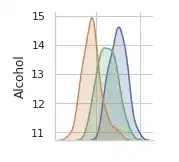
You may have noticed that the figures along the diagonal look different. They are histograms of values of individual variables. We can see that the "Ash" and "Alcalinity of ash" variables are roughly normally distributed.

Here is the first figure along the diagonal.

enter image description here

Consider the Alcohol column, is the correlation of Alcohol and itself the histogram or just for programming convenience?
whnlp
  • 227
  • 1
    A scatter plot (in my reading a more common term than correlation plot) of a variable against itself would be informative, as it shows the distribution of that variable on the diagonal $y = x$. You would certainly see marked outliers and perhaps other features too, depending partly on the number in the sample. But a histogram or density plot is often easier to think about. – Nick Cox Sep 18 '19 at 15:41

1 Answers1

6

Seaborn's pairplot gives out what's called a "correlation plot" (see another example using MATLAB here). Since a correlation of a variable $X$ and itself is always one, there's little use displaying this. So by convention these plots plot out the variable's histogram/distribution instead. This is also noted in the function's documentation:

The diagonal Axes are treated differently, drawing a plot to show the univariate distribution of the data for the variable in that column.

Art
  • 438