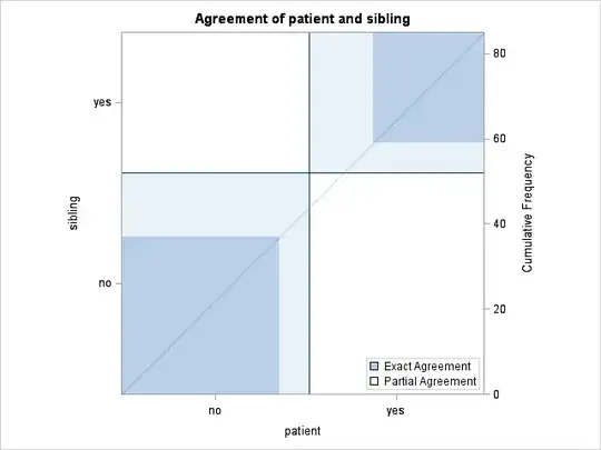
I'm running a simple McNemar's test for agreement on the McNemar's example from Wikipedia. The test uses the following data:

for patients of Hodgkin's disease. Running this SAS code:
data hodgkins;
input hodgkins $ sibling $ count;
datalines;
yes yes 26
yes no 15
no yes 7
no no 37
;

proc freq data=hodgkins;
    tables hodgkins * sibling /agree;
    weight count;
run;
which generates this plot. How do I interpret this plot? I know that McNemar's test deals with probabilities of discordant pairs, which I understand. In this case, the simple null would be that the probability that a Hodgkin’s patient having tonsil’s removed while sibling not having them removed is equal to a Hodgkin’s patient not having tonsils removed while sibling did, but I'm not entirely sure how this applies to the plot.