Yes, a moving average with large $\lambda$ will be close to Normally distributed. No, this calculation is not legitimate.
Because the cumulant generating function (cgf) of a Poisson distribution of intensity $\lambda$ is $$\psi_\lambda(t) = \lambda(e^{it}-1) = i(t\lambda) + \frac{1}{2!}(it\sqrt{\lambda})^2+\lambda^{-1/2}\frac{1}{3!}(it\sqrt{\lambda})^3 + \cdots$$
and the cgf of a Normal distribution with mean $\lambda$ and variance $\lambda$ is $$\phi_\lambda(t) = i(t\lambda) + \frac{1}{2!}(it\sqrt{\lambda})^2,$$
the terms
$$\lambda^{-1/2}\frac{1}{3!}(it\sqrt{\lambda})^3 + \cdots$$
express their difference. The factor of $\lambda^{-1/2}$ multiplying them indicates how rapidly the Poisson approaches the Normal as $\lambda$ increases. Look at the two distributions for $\lambda=260$:

The heights of the bars are the Poisson probabilities while the red curve gives the corresponding Normal densities (per unit interval). They are almost indistinguishable.
The calculation in question is described thus:
the broken grey lines show the likely range of random statistical variation around the 5-year moving average ... if the number of deaths can be represented as the result of a Poisson process, for which the underlying rate at which the events (deaths) occur is given by the 5-year moving average, then random year to year variation would result in only about one year in 20 having a figure outwith [sic] this range (which is a ‘95 per cent confidence interval’, calculated thus: the underlying rate of occurrence plus or minus 1.96 times its standard deviation;...
This is erroneous because it fails to account for variation in the average itself. To analyze that, let $X_1, X_2, \ldots, X_5$ be the counts in the five (non-overlapping) years and suppose they are independent (as they would be in a Poisson process). Then the "random year to year variation ... around the 5-year moving average" is the variance of $X_i - \bar X$ where $\bar X=(X_1+\cdots+X_5)/5$ is the five-year average. Due to independence, all five of these variances are the same, equal to the first, which can be computed as
$$\operatorname{Var}(X_1 - \bar X) = \operatorname{Var}\left(\frac{4}{5}X_1 - \frac{1}{5}X_2 - \cdots - \frac{1}{5}X_5\right) \\= \left(\frac{4}{5}\right)^2\lambda + \left(-\frac{1}{5}\right)^2\lambda + \cdots + \left(-\frac{1}{5}\right)^2\lambda = \frac{4}{5}\lambda.$$
Consequently the correct interval (it's not a confidence interval) for 95% of these variations would have a half-width of $$1.96 \sqrt{4\lambda/5}\approx 0.89(1.96\sqrt{\lambda}),$$ over 10% shorter than claimed. The discrepancy can be appreciated in this simulation of 100,000 five-year averages (giving 500,000 such deviations):

The gray bars are a histogram of annual deviations from the five-year means. The red curve uses the paper's formula. The blue curve uses the adjusted variance (multiplied by $4/5$). It is clear which is correct.
Note that neither of these calculations is truly appropriate in the application: the interval does not account for the fact that $\lambda$ is estimated (uncertainly) from the data. Accounting for this ought to widen the interval. As a result, the values computed in the paper will come out close to correct--but only because of this accidental near-cancellation of two separate errors!
So that you can check, here is the code (in R) used for the simulation.
lambda <- 260 # Annual rate
n <- 5        # Years in window
n.sim <- 1e5  # Windows to simulate

x <- matrix(rpois(n.sim*n, lambda), n.sim) # Annual values
x <- x - rowMeans(x)                       # Deviations from means

hist(x, breaks=seq(floor(min(x))-1/2, ceiling(max(x))+1/2), freq=FALSE,
     col="White", border="#c0c0c0",
     main="Simulated five-year deviations")
curve(dnorm(x, 0, sqrt(260)), col="Red", lwd=2, add=TRUE)       # As in the paper
curve(dnorm(x, 0, sqrt(260 * 4/5)), col="Blue", lwd=2, add=TRUE)# Corrected
The following material has been added in response to comments.
By focusing on fluctuations in this short time series, the paper makes much of very little. Clearly there is a trend. A simple reasonable way to explore a trend is to fit a growth model, such as regressing the log counts against time. Here is a summary.
Residuals:
      Min        1Q    Median        3Q       Max
-0.153579 -0.060968  0.008444  0.046664  0.213764

Coefficients:
              Estimate Std. Error t value Pr(>|t|)
(Intercept) -1.071e+02  7.593e+00  -14.10 3.60e-11 ***
x            5.638e-02  3.786e-03   14.89 1.45e-11 ***
---
Signif. codes:  0 ‘***’ 0.001 ‘**’ 0.01 ‘*’ 0.05 ‘.’ 0.1 ‘ ’ 1

Residual standard error: 0.09763 on 18 degrees of freedom
This regression estimates a 5.6% annual trend ($p \lt 10^{-10}$: it's significant). All data fluctuate around the fit but remain within 25% of it. The typical amount of fluctuation is 10%.
Specialized models are not required. The large counts indicate a general linear model is unnecessary. There is little evidence of serial correlation, suggesting a time series model would add nothing to the analysis. To identify outliers and temporary fluctuations, one may supplement this simple regression with a robust smooth, such as Loess (shown here), IRLS, or possibly a GAM. Loess is used below; there are no outliers among its residuals. The models that allow for detailed temporary fluctuations tend to fit the data more closely and (accordingly) be more optimistic about the random fluctuations: that is, they probably overfit the data and thereby underestimate how much of the fluctuation should be viewed as random. Thus, the simpler regression model should be preferred provided it fits the data adequately.
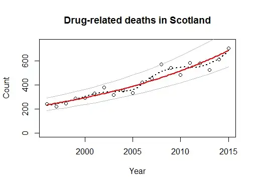
The hollow dots show the data. The dashed black line is a Loess smooth (using the R loess function with a span of 1/2). The solid red line is the regression of log count against the year. The solid gray lines above and below it are a symmetric 95% prediction interval. Indeed, 95% of the data points lie within those lines and the remaining one is right on one of the lines. This implies none of the data points should be viewed as unusual in the context of this fit.
The usual diagnostic plots of residuals (not illustrated) show nothing is amiss; in particular, there are no outliers.
Consequently, a good description of these data is that
Drug-related deaths have been growing at 5.6% per year between 1996 and 2015, with no exceptional years to note.
This sentence replaces--and improves upon--more than a page of dense text in the report, spanning sections 3.1.2 and 3.1.3.


So, the authors are attempting to identify outliers in each 5-year band, what would be a more suitable calculation?
Also you say at the end that lambda is estimated, you mean the 5-year moving average lambda here?
– leixlipred Dec 01 '16 at 18:14