12

I am trying to apply Fisher's exact test in a simulated genetics problem, but the p-values appear to be skewed to the right. Being a biologist, I guess I'm just missing something obvious to every statistician, so I would greatly appreciate your help.

My setup is this: (setup 1, marginals not fixed)
Two samples of 0s and 1s are randomly generated in R. Each sample n = 500, probabilities of sampling 0 and 1 are equal. I then compare the proportions of 0/1 in each sample with Fisher's exact test (just fisher.test; also tried other software with similar results). Sampling and testing is repeated 30 000 times. The resulting p-values are distributed like this: p-value distribution

Mean of all the p-values is around 0.55, 5th percentile at 0.0577. Even the distribution appears discontinuous on the right side.

I've been reading everything I can, but I don't find any indication that this behavior is normal - on the other hand, it's just simulated data, so I see no sources for any bias. Is there any adjustment I missed? Too small sample sizes? Or maybe it's not supposed to be uniformly distributed, and the p-values are interpreted differently?
Or should I just repeat this a million times, find the 0.05 quantile, and use that as the significance cutoff when I apply this to actual data?

Thanks!


Update:

Michael M suggested fixing the marginal values of 0 and 1. Now the p-values give a much nicer distribution - unfortunately, it's not uniform, nor of any other shape I recognize:
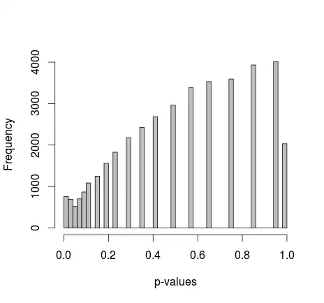
p-vals w fixed marginals

adding the actual R code: (setup 2, marginals fixed)

samples=c(rep(1,500),rep(2,500))
alleles=c(rep(0,500),rep(1,500))
p=NULL
for(i in 1:30000){
  alleles=sample(alleles)
  p[i]=fisher.test(samples,alleles)$p.value
}
hist(p,breaks=50,col="grey",xlab="p-values",main="")

Final edit:
As whuber points out in the comments, the areas just look distorted due to binning. I am attaching the QQ-plots for the setup 1 (free marginals) and setup 2 (fixed marginals). Similar plots are seen in Glen's simulations below, and all these results in fact seem rather uniform. Thanks for the help!
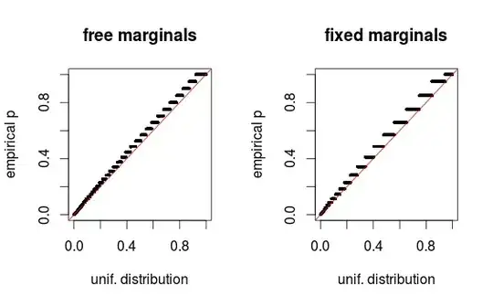
pval-qqplot

juod
  • 2,240
  • 13
  • 20
  • 2
    Try to repeat your simulation while holding not only the group sizes (500 each) but also the sum of "1" (over the pooled sample) constant. The p value of Fisher's exact test is derived under this "fixed marginal distribution" setting. Does the picture look better then? Btw. you cannot expect the p-value distribution to be exactly uniform by the discrete nature of the sampling distribution (i.e. the hypergeometric). – Michael M Jul 21 '15 at 19:57
  • Thanks for the suggestion, although it didn't solve the problem. I'll update the question right away – juod Jul 21 '15 at 20:30
  • 1
    It might be useful to have look at your R code. – conjugateprior Jul 21 '15 at 20:47
  • Added the R code. I get similar results if I export the columns of randomized 0/1s and calculate Fisher's test in a genetic software called PLINK - I was thinking, maybe it's some property of the test itself?.. – juod Jul 21 '15 at 21:48
  • You should set the seed for reproducibility. I used set.seed(6069). I get a histogram with the same profile as yours, but I notice that mean(p<.05) # [1] 0.0516. I'll do more later. – gung - Reinstate Monica Jul 21 '15 at 22:10
  • The p-value is uniformly distributed if the null hypothesis is true. That's probably not the case for a majority of the tests. – Glen Jul 21 '15 at 22:34
  • 1
    @Glen it seems to me from the code that in each iteration both samples have the same number of 0s and 1s (i.e. null hypothesis should hold) or am I wrong? – bdeonovic Jul 21 '15 at 22:55
  • @Glen, bdeonovic: Let's say sample 1 has some number A of 1s, and sample 2 has some number B of 1s. A and B are not equal here - if it were so, every time the test statistic would be the same - but A+B stays constant. In other words, it's always 500 zeros and 500 ones, but sometimes they are divided equally between the samples, and sometimes they are not. Thinking this way, "no difference between samples" is probably the most frequent case - but it should be reflected in the test statistic, not the p-value... Am I understanding this correctly? – juod Jul 21 '15 at 23:08
  • @juod I see, then Glen's comment stands to explain the phenomenon: p-values are uniformly distributed under the null hypothesis, which does not hold in each of your simulation iterations. – bdeonovic Jul 21 '15 at 23:22
  • 5
    These histograms look remarkably uniform to me. You have to remember that histograms display probability (or frequency) by means of area. The increasing gaps to the right (due to the unavoidable discreteness of the p-value distribution of any nonrandomized test of discrete data) cause the bar heights to increase, but their areas seem to be almost constant. Instead of using a histogram to assess uniformity, graph the empirical CDF. – whuber Jul 21 '15 at 23:45
  • 2
    Aside from the specific distribution, this question appears to be completely answered here – Glen_b Jul 22 '15 at 09:43

1 Answers1

10

The problem is the data are discrete so histograms can be deceiving. I coded a simulation with qqplots that show an approximate uniform distribution.

library(lattice)
set.seed(5545)
TotalNo=300
TotalYes=450

pvalueChi=rep(NA,10000)
pvalueFish=rep(NA,10000)

for(i in 1:10000){
  MaleAndNo=rbinom(1,TotalNo,.3)
  FemaleAndNo=TotalNo-MaleAndNo
  MaleAndYes=rbinom(1,TotalYes,.3)
  FemaleAndYes=TotalYes-MaleAndYes
  x=matrix(c(MaleAndNo,FemaleAndNo,MaleAndYes,FemaleAndYes),nrow=2,ncol=2)
  pvalueChi[i]=chisq.test(x)$p.value
  pvalueFish[i]=fisher.test(x)$p.value
}

dat=data.frame(pvalue=c(pvalueChi,pvalueFish),type=rep(c('Chi-Squared','Fishers'),each=10000))
histogram(~pvalue|type,data=dat,breaks=10)
qqmath(~pvalue|type,data=dat,distribution=qunif,
       panel = function(x, ...) {
         panel.qqmathline(x, ...)
         panel.qqmath(x, ...)
       })

enter image description here

enter image description here

Glen
  • 7,250
  • 5
    Such spikes and dips in histograms or bar charts of discrete data are often artifacts of the binning procedure. Don't trust them: use more discerning plots of the distributions, such as QQ plots or graphs of the ECDFs. Even if they are real, nobody will care provided the distributions of p-values are approximately uniform and of the right density where it matters for decision making: in the interval close to zero (and certainly less than 0.5). – whuber Jul 21 '15 at 23:47
  • Excellent point @whuber, I'll update with qqplots. – Glen Jul 22 '15 at 00:02
  • 2
    @whuber, Glen, thanks so much! In fact the binning was deceptive, as simply splitting Glen's histograms into more breaks gave a similar pattern to mine. And I also get linear empirical CDF/QQ with my simulations, so the problem seems to be solved. – juod Jul 22 '15 at 00:10
  • @juod: it would be highly appreciated if you could add the qqplot for illustration, maybe even for both simulations? – Michael M Jul 22 '15 at 05:38
  • The qq plots really help--thank you. Don't you want to change the first paragraph of your answer, though? Do you still maintain there is a problem with the simulation and that there is a "spike" in the p-value distribution? – whuber Jul 22 '15 at 15:14