I noticed that the critical $\chi^2$ value increases as the degrees of freedom increase in a $\chi^2$ table. Why is that?

I noticed that the critical $\chi^2$ value increases as the degrees of freedom increase in a $\chi^2$ table. Why is that?
The following say the same thing:
For a given "area to the right of the critical value," called $\alpha$ (Greek "alpha"), the critical value increases with the degrees of freedom, called $\nu$ (Greek "nu").
For a given critical value $c$, $\alpha$ increases with $\nu$.
For any given number $c$, the chance that a $\chi^2(\nu)$ variable $W$ exceeds $c$ increases as $\nu$ goes up.
This has a pretty graphical interpretation. Imagine filling in missing columns for other areas $\alpha$ like $\alpha=0.5$ or $\alpha=0.000001$. Each individual row--for each $\nu$--would express a relation between all those values of $\alpha$, as written in the top header, and the entries $c$. We may graph this relation. It's conventional to put $c$ on the horizontal axis and $\alpha$ on the vertical. Thus, for instance, the top row (for $\nu=21$) contains the ten points $(8.033653, 0.995),$ $(8.897198, 0.99),$ $\ldots, (41.401065, 0.005)$, as shown by the black dots in the left plot:

Of course the filled-in curve has to drop from the highest possible probability of $1$ to the lowest possible value of $0$, because as the critical value increases it becomes less and less likely that $W$ will exceed it.
The right hand plot shows all the values in the table, with the missing columns filled in with curves. Each curve--which is a completely filled-in row of the table--drops from left to right. Their shapes change a little, taking longer to drop the further to the right they go. Ordinarily, when you have a set of curves like this that are shifting and changing their shapes, any two of them will tend to cross each other somewhere. However, in this case if you fix any elevation $\alpha$ and watch what happens as $\nu$ increases, the points on the curves march off consistently to the right: that's what it means for the critical values to increase. The leftmost (green) plots must therefore correspond to the smaller values of $\nu$ near the top of the table and the right hand plots track what happens as $\nu$ grows and we move down through the table. The rightmost (gray) plot shows the values in the bottom row of the table.
In short, these complementary cumulative distribution functions never overlap: as $\nu$ increases, they shift to the right without ever crossing.
That's what is happening. But why?
Recall that a $\chi^2(\nu)$ distribution describes the sum of squares of $\nu$ independent standard Normal variables. Consider what happens to such a sum of squares
$$W = X_1^2 + X_2^2 + \cdots + X_\nu^2$$
when one more square, $X_{\nu+1}^2$, is added to it. Fix a critical value $c$ and suppose $W$ has a chance $\alpha$ of exceeding $c$. Formally,
$$\Pr(W \gt c) = \alpha.$$
Then, because $X_{\nu+1}^2$ is almost surely positive,
$$\Pr(W + X_{\nu+1}^2 \gt c) = \Pr(W \gt c) + \int_0^c \Pr(X_{\nu+1}^2 \gt \varepsilon) f_\nu(c-\varepsilon)d\varepsilon.$$
This expression breaks the situation where $W + X_{\nu+1}^2 \gt c$ into an (infinite) collection of mutually exclusive possibilities. Axioms of probability say that the total chance that $W + X_{\nu+1}^2$ exceeds $c$ must be the sum of all these separate probabilities. I have broken the sum into two parts:
The first term on the right is the chance that $W$ already exceeds $c$, in which case adding $X_{\nu+1}^2$ only makes the sum larger.
The second term on the right (an integral) contemplates all the possibilities where $W$ does not exceed $c$ but $X_{\nu+1}^2$ is large enough to still make $W+X_{\nu+1}^2$ greater than $c$. It uses "$f_\nu$" to represent the probability density function (PDF) of $W$. When $c \gt 0$, the second term is strictly positive (because it can be interpreted as the area under a curve of positive heights and positive horizontal extent going from $0$ to $c$).
Intuitively, this all says that adding another squared normal variate $X_{\nu+1}^2$ to $W$ can only make it more likely that the sum of squares exceeds $c$. That is statement (3), which is the same thing as (1), as asked in the question.
Let's recall what a $p$-value is. It is the probability of getting a value as far or further away from a reference / null value as your observed value, if the null hypothesis is true. In your case, you are working with $\chi^2$, so it is the probability of getting an observed $\chi^2$ test statistic as far or further from the expected value if the null hypothesis is true. Moreover, the $\chi^2$ is essentially always a one-tailed test (see here), so we are only interested in the probability of finding a value that far over to the right or further to the right within the null distribution.
Given an observed $\chi^2$ value and the relevant degrees of freedom, you can calculate the $p$-value directly. But you wouldn't want to try it with pen and paper. Nowadays, you can get such $p$-values quite easily with a computer and statistical software (such as R), but tables like the ones you show were very convenient back in the days when computers were not widespread. The idea was that you could set $\alpha$ to any of the values listed along the top ($0.05$ is most common), and look up the critical value of $\chi^2$ according to your degrees of freedom. Then, if the $\chi^2$ value from your analysis was greater than that critical value, you knew that $p<\alpha$ (although you didn't actually know how much less / what the actual $p$-value was).
From the above, we can see that your question becomes: 'Why do we need a progressively higher observed $\chi^2$ value to be in the top $\alpha\%$ of the distribution as the degrees of freedom increases?'
The answer is that the null (more specifically the central) $\chi^2$ distribution changes when the degrees of freedom changes. You can see this in @Hamed's helpful plot: The quantile (observed $\chi^2$ value) that separates the top, say, $5\%$ of the distribution from the bottom $95\%$ is getting larger. Consider just the distributions with df = 2 and df = 9:

The chi-squared distribution with $n$ degrees of freedom is the sum of the squares of $n$ independent (0,1)-normal distributions. Each summand has positive expected value, so the chi-squared distribution will have larger and larger mean as $n$ increases. In addition, the standard deviation also increases, and the critical values do as well.
Specifically, for large $n$ the mean of the chi-squared distribution is approximately $n$ and the standard deviation is approximately $\sqrt{2n}$.
I guess the best way of understanding is looking at density plot for different degrees of freedom.
If you run the R code below,
x = seq(0, 25, length.out=100)
plot(x, dchisq(x=x, df=2), type='l', col=2, ylab='density')
for(i in 3:9){
  y = dchisq(x=x, df=i)
  lines(x, y, col=i)
}
legend('topright', legend=paste('df = ', 2:9), col=2:9, fill=2:9)
you will get this nice plot:
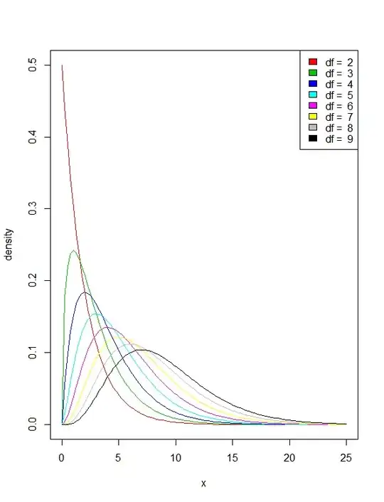
It is clear that with increasing degree of freedom, the tails of the distribution get thicker and thicker. That shows that the $P(X<x)=a$ happens in larger value of $x$.