Guys.
I have a question about a Safari minimal view in the portrait orientation when a user scrolls pages.
My stack: Laravel 8/Vue js 2.6.12/TailwindCss.
Problem: Pages don’t go to minimal view on a long page like a news page when user scrolls (portrait orientation).
Please, see the following discussion for clarification:
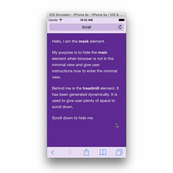
iOS 8 removed "minimal-ui" viewport property, are there other "soft fullscreen" solutions?
Clearly
From this topic I should create a div wrapper, set overflow:auto or :hidden and it must work:
“A common approach to the problem is to have a wrapper div that fills the browser viewport, set overflow to hidden or auto, then scroll horizontally and/or vertically inside it.”
I made (#app div) it as you will see below in the code but it doesn't work.
I have the following master blade:
<!-- resources/views/basic.blade.php -->
<html lang="{{ app()->getLocale() }}">

<head>
    <meta charset="utf-8" />
    <meta http-equiv="X-UA-Compatible" content="IE=edge,chrome=1" />
    <title>Vue JS: Steilgut demo | @yield('title', 'Vue JS: Steilgut demo 2')</title>
    <meta name="description" content="Vue JS: Steilgut demo 2" />
    <meta name="keywords" content="Vue JS: Steilgut demo 2" />
    <!-- CSRF Token -->
    <meta name="csrf-token" content="{{ csrf_token() }}">
    <!--[if lt IE 9]>
    <script src="js/html5shiv.js"></script>
    <![endif]-->
    {{-- <script type="text/javascript" src="./js/vue.js"></script> --}}
    {{-- <script type="text/javascript" src="./js/vue-router.js"></script> --}}
    <!-- <link rel="stylesheet" href="css/reset.css"/> -->
    <meta name="HandheldFriendly" content="True" />
    <meta name="MobileOptimized" content="320" />
    <meta name=apple-mobile-web-app-capable content=yes>
    <meta name="viewport"
        content="width=device-width, initial-scale=1.0, maximum-scale=1.0, minimum-scale=1.0, user-scalable=no" />
    {{-- <meta name="viewport" content="width=device-width, initial-scale=1.0, maximum-scale=1.0, minimum-scale=1.0, user-scalable=no" /> --}}
    @yield('exp_head')
</head>

<body class="fp">
    @yield('content')
</body>

</html>
App blade.
@extends('layouts.master')

@section('exp_head')
    <link href="{{ asset('css/app.css') }}" rel="stylesheet" />
    <link href="{{ asset('css/normalize.css') }}" rel="stylesheet" />
    {{-- <link href="{{ asset('css/fonts.css') }}" rel="stylesheet"> --}}
    {{-- <script src="https://use.fontawesome.com/2ba7753f9f.js"></script> --}}
    <link rel="stylesheet" href="https://cdnjs.cloudflare.com/ajax/libs/font-awesome/5.15.2/css/all.min.css"

    <script src="/js/events.js"></script>
    <script src="{{ asset('js/app.js') }}" async></script>
@endsection
@section('content')
    <div id="app" class="fp" v-cloak>
        <router-view></router-view>
    </div>
@endsection
To visit the app user must accept an agreement so that when he passes a start page he is routed to a root component called as masthead because of that I place <router-view></router-view> in the app.blade.php:
MastheadComp:
<template>
    <div
        id="masthead"
        class="steilgut-masthead ar-balanced-page"
        :style="getStyleClassList"
    >
 <div class=”masthead-content”>
    <header>...</header>

    <transition name="routes-fade">
       <router-view />
    </transition>

    <footer></footer>
 </div>
  </div>
</template>
As you can see all content pages sit inside the .masthead-content container. Below you can see css-fragments for body/html. #app and etc:
html, body =>
...
html {
  width: 100%;

  height: 100%;
  height: 100vh;
  height: -webkit-fill-available;
  height: -moz-available;
}

body {
  height: 100%;
  min-height: 0; // flex box stops to stretch to content size so we can scroll

  width: 100%;
  width: 100vw;
  width: -moz-available;
  width: -webkit-fill-available;

  min-width: 100%;
  min-width: 100%;
  min-width: 100vw;
  min-width: -moz-available;
  min-width: -webkit-fill-available;

  margin: 0;
  padding: 0;
  overflow: hidden;
}
...

app.scss =>
...
  #app {
    display: flex;
    flex: 1 0 100%;
    flex-direction: column;

    width: 100%;
    height: 100%;
    min-height: 100%;
    overflow: auto;
    -webkit-overflow-scrolling: touch;
}
..

.steilgut-masthead,
.masthead-content {
    display: flex;
    flex: 1 0 100%;
    flex-direction: column;
    width: 100%;
    min-width: 100%;
    height: 100%;
    align-items: stretch;
    /* border: 2px solid #ebcb9a; */
}

.steilgut-masthead {
    position: relative;
    z-index: 5;

    overflow: auto;
    max-width: 100%;
}
So question: what is the reason for the issue? Will appreciate any working advice.