3

I am stuck at a point where i dont know where to go....I am trying to create a grid system for my website but not getting the desired output.

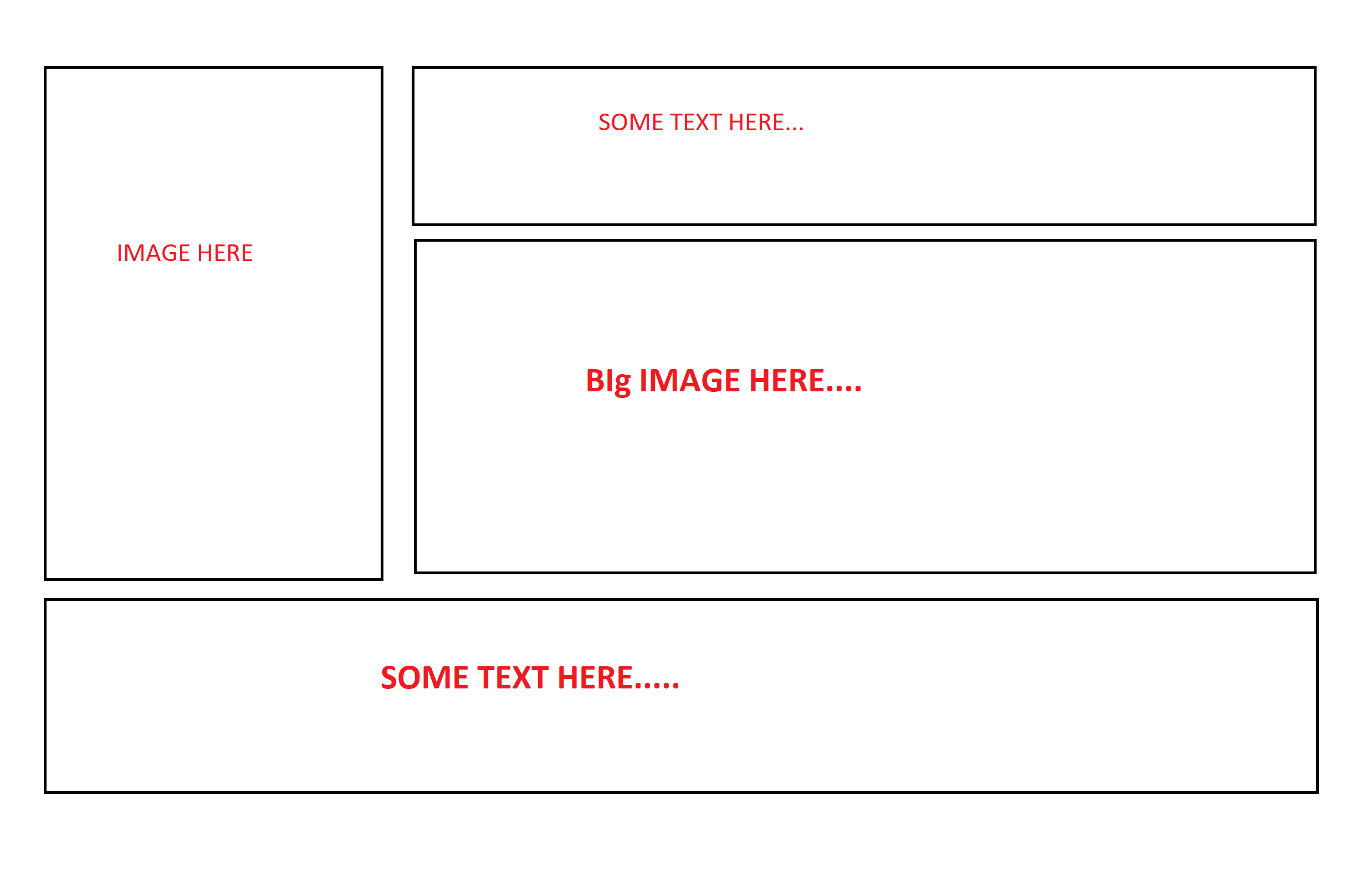
Here is the output structure which i want to create using Bootstrap 4:

enter image description here

My Code :

 <section class="homepage-banner-section">

            <div class="container">
                <div class="row">
                    <div class="col-sm-4 col-md-4">
                         <img src="img/home-banner-one.png" class="img-fluid" alt="Responsive image">
                    </div>
                    <div class="col-sm-8 col-md-8">
                        <div class="row">
                            <div class="col-sm-4">
                                Some text here
                            </div>
                            <div class="col-sm-8">
                                <img src="img/home-banner-two.png" class="img-fluid" alt="Responsive image">
                            </div>
                        </div>
                    </div>
                </div>
                <div class="row">
                    <div class="col-sm-12">
                        Some Text Here
                    </div>
                </div>
            </div>

        </section>

I will appreciate it if someone guide me the right direction.Have lack of knowledge about bootstrap grid system and column classes.

blurfus
  • 12,450
  • 7
  • 53
  • 58
MA-2016
  • 641
  • 3
  • 8
  • 25

2 Answers2

3

If you change both col-sm-4 to col-12 you will get two full width columns inside your row.

<link href="https://cdnjs.cloudflare.com/ajax/libs/twitter-bootstrap/4.3.1/css/bootstrap.min.css" rel="stylesheet"/>
<section class="homepage-banner-section">

  <div class="container">
    <div class="row">
      <div class="col-sm-4 col-md-4">
        <img src="img/home-banner-one.png" class="img-fluid" alt="Responsive image">
      </div>
      <div class="col-sm-8 col-md-8">
        <div class="row">
          <div class="col-12">
            Some text here
          </div>
          <div class="col-12">
            <img src="img/home-banner-two.png" class="img-fluid" alt="Responsive image">
          </div>
        </div>
      </div>
    </div>
    <div class="row">
      <div class="col-sm-12">
        Some Text Here
      </div>
    </div>
  </div>

</section>
brooksrelyt
  • 3,762
  • 5
  • 28
  • 49
  • this solution creates another problem which i am trying to resolve.I have posted the new question here: https://stackoverflow.com/questions/54844394/huge-space-below-two-rows-in-bootstrap – MA-2016 Feb 23 '19 at 17:59
2

You can divide your section / container into two columns (left/right) and then the right column into rows (text/image)

Something like below (see demo)

<link rel="stylesheet" href="https://stackpath.bootstrapcdn.com/bootstrap/4.3.0/css/bootstrap.min.css">
<script src="https://code.jquery.com/jquery-3.3.1.slim.min.js"></script>
<script src="https://cdnjs.cloudflare.com/ajax/libs/popper.js/1.14.7/umd/popper.min.js"></script>
<script src="https://stackpath.bootstrapcdn.com/bootstrap/4.3.0/js/bootstrap.min.js"></script>
<section class="homepage-banner-section">
  <div class="container">
    <div class="row">
      <!-- left column -->
      <div class="col-xs-4">
        <img src="https://placekitten.com/200/300" class="img-fluid" alt="Responsive image">
      </div>
      <!-- right column -->
      <div class="col-xs-8">
        <!-- first row -->
        <div class="row">
          <div class="col">
            some text only on right column
          </div>
        </div>
        <!-- second row -->
        <div class="row">
          <div class="col">
            <img src="https://placekitten.com/300/100" class="img-fluid" alt="Resp. img">
          </div>
        </div>
      </div>
    </div>
    <!-- footer -->
    <div class="row">
      <div class="col-xs-12">
        footer text that goes the width of the container
      </div>
    </div>
  </div>
</section>
blurfus
  • 12,450
  • 7
  • 53
  • 58
  • I tried your way by putting sm instead of xs but the problem i am facing right now is that there is a huge space between those two rows...I have added my own images in the image tags and then gave the custom heights of parent divs of the images....dont know what i am doing wrong.I can show you the live site in private chat if you want. – MA-2016 Feb 23 '19 at 16:03
  • @ma123456 it sounds like the issue now is the gap in between the rows - which is different than the original question. Please create a new question for the gap problem - Also, in the new question, add a [mcve] so we can troubleshoot faster – blurfus Feb 23 '19 at 16:22
  • @ma123456 make sure you also mark an answer as correct :) – blurfus Feb 23 '19 at 16:28