119

I came across this problem a few times and was wondering if there was a solution to this problem. My problem occurs on the Chrome mobile app. There, you can scroll down a bit and the address bar disappears. So far, so good, let's make an example:
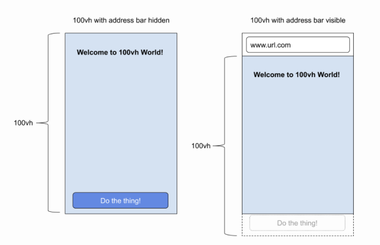
The container's height is set to 100vh.

How it looks with the address bar

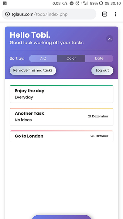
As you can see, the bottom part gets cut off.

When I scroll down, it looks like this:

enter image description here

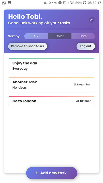
Now it looks good. So obviously Chrome calculates the address bar's height into the viewport height. So my question is:

Is there a way, that it looks the same with or without the address bar? So that the container expands or something?

danronmoon
  • 3,682
  • 5
  • 33
  • 56
Tobias Glaus
  • 2,516
  • 2
  • 17
  • 36
  • Only a script-solution could fix this. Read here: https://stackoverflow.com/questions/37112218/css3-100vh-not-constant-in-mobile-browser – ArayniMax Oct 17 '18 at 07:01
  • without code it'll be difficult to help you.. – aflyzer Oct 17 '18 at 07:35
  • Maybe you should give a look at: https://developers.google.com/web/fundamentals/native-hardware/fullscreen/ and this question: https://stackoverflow.com/questions/28647604/force-hide-address-bar-in-chrome-on-android – Puka Oct 17 '18 at 07:39
  • 4
    Why don't you use height:100% instead of 100vh? The Chrome app returns the value including the address bar of height 100vh. – Andrew Li Mar 28 '19 at 09:50
  • 4
    @AndrewLi As you can see, there is a list. With 100%, the container wouldn't be full height. I'd have to set 100vh on the body height to make it work then, which resulted in the same problem. – Tobias Glaus Mar 28 '19 at 10:02
  • 2
    I have the same problem, but set the height in 100% doesn't fix it. – David Minaya May 15 '20 at 14:26
  • The event `visualViewport.resize` is fired while the url bar is appearing/disappearing, so you can bind to this one `visualViewport.addEventListener('resize', function() { })`. I haven't found a css only solution. https://stackoverflow.com/a/67947384/8941307 – Pieterjan Jul 03 '21 at 11:29

8 Answers8

106

As per this official article on Chrome web, the proper way to set the height to fill the visible viewport is with height: 100%, either on the <html> element or on a position: fixed element. As the document describes, this ensures compatibility with mobile Safari and is independent of how large the URL bar is.

Ross Light
  • 4,203
  • 1
  • 23
  • 35
  • 2
    Thank you very much. This article actually helped me understand what was happening behind the scene. So for my usecase, 100% seemed right, because it was a `position: fixed` element anyway. – Swashata Ghosh Jan 06 '20 at 15:30
  • 9
    It's important to note that if you still want to be able to facilitate scroll-toggling of the address bar visibility the height of the `` should still be set to `100vh` (or something greater than 100%) and only the target fill element should be assigned `position: fixed; height: 100%`. – Chunky Chunk Feb 10 '20 at 23:45
  • 2
    I have the same problem, but set the height in 100% doesn't fix it. – David Minaya May 15 '20 at 13:59
  • 1
    The only one answer that really works for me. Thank you. – Hunja Mar 02 '21 at 11:27
28

Try using min-height: -webkit-fill-available. You can also add it below height: 100vh as a fallback.

cnotethegr8
  • 6,774
  • 7
  • 61
  • 96
12

The community still have no strict agreement how should browsers behave with movement of top, bottom and side panels from the developers point of view.

The mentioned problem in the question is well known:

enter image description here

  1. It all started with the Apple Webkit Issue. One of the problems was that website developers used vh for calculation of the font size (calc(100 / vh * something)). If 100vh would be dynamic, when a user scrolls down and the address bar is hidden, then font size, as any other bound elements, will be distorted producing very bad user experience, not to mention to be CPU/GPU intensive task.
    Apple decision was to match the larger size of the screen (without address bar) to 100vh constantly. So, when the address bar is displayed and you use 100vh height the bottom part will go out of the screen. Many developers do not agree to that decision and consider viewport units to be dynamic and exactly equal to the visible "view port".

  2. The Google Chrome team decided to be compatible with the Apple browser and stick to the same decision.

  3. height: 100% in most modern browsers equal to the real visible part, i.e. the height varies and depends on whether address bar is visible or hidden during the scroll.

  4. Bars can appear not only a the top of the screen, but also at the bottom (modern iOS), as well as an onscreen keyboard can make the view shorter. There is a nice demo to check in mobile devices the actual size of 100vh vs 100%.
    enter image description here


Solution 1

html, body { height: 100%; }
.footer-element { 
  position: fixed; 
  bottom: 10px;
}

Solution 2
Compensate some dependency on the vh with the visible bar height equal to the "100vh - 100%", when the bar is hidden the difference will be 0.

html, body { height: 100vh; }
.footer-element { 
  position: fixed; 
  bottom: calc(10px + (100vh - 100%));
}
Artur A
  • 5,731
  • 51
  • 57
9

you can fix the address bar issue with setting height: 100% on html and body tag and off course set margin and padding of body to zero and also you can handle scrolling in your main div for better controll

7
.my-element {
  height: 100vh; /* Fallback for browsers that do not support Custom Properties */
  height: calc(var(--vh, 1vh) * 100);
}

Now let’s get the inner height of the viewport in JavaScript:

// First we get the viewport height and we multiple it by 1% to get a value for a vh unit
let vh = window.innerHeight * 0.01;
// Then we set the value in the --vh custom property to the root of the document
document.documentElement.style.setProperty('--vh', `${vh}px`);

source: https://css-tricks.com/the-trick-to-viewport-units-on-mobile/

Mahdi Bashirpour
  • 13,853
  • 11
  • 101
  • 132
3

I just figured out a way how to resize the element so that the height doesn't include the android home-button-less smartphones with the onscreen-navbar AND the browser top bar. If the content is bigger than the screen the element should grow to the size it can fit everything, that's why I am using min-height.


EDIT:

Added a snippet using a class instead of changing the styling in JS

// save old window size to adjust only if width changed
let oldWidth = window.innerWidth,
  oldHeight = window.innerHeight;
// element to adjust
const target = document.querySelector(".vh100");
// adjust the size if window was resized
window.addEventListener("resize", handleResize);

function handleResize(initial = false) { // the parameter is used for calling the function on page load
  /*
   * if the width changed then resize
   * without this Chrome mobile resizes every time navbar is hidden
   */
  if (window.innerWidth !== oldWidth || initial) {
    // stretch the target
    target.classList.add("setting-100vh");
    // save height and apply as min height
    const h = target.clientHeight;
    target.classList.remove("setting-100vh");
    target.style.minHeight = h + "px";
  }
}
// call when page is loaded
handleResize(true);
* {
  margin: 0;
}

.vh100 {
  background-color: green;
}


/*
* Stretch the element to window borders and save the height in JS
*/

.setting-100vh {
  position: fixed;
  top: 0;
  bottom: 0;
  min-height: unset;
}
<body>
  <header class="vh100">
    <h1>100vh on mobile</h1>
  </header>
  <main>
    <p>Lorem ipsum dolor sit amet consectetur adipisicing elit. Possimus ipsa officia mollitia facilis esse cupiditate, nisi recusandae quas id enim alias eaque suscipit voluptates laudantium quasi saepe deserunt labore fuga deleniti placeat, necessitatibus
      quibusdam. Quaerat adipisci provident minima laboriosam modi ullam accusamus error dolores iure ducimus laborum similique distinctio temporibus voluptas nulla quod ipsa, nostrum quam cumque id animi unde consectetur incidunt! Dolorem sed quisquam
      at cumque. Cumque non nam exercitationem corporis? Minus sed explicabo maiores ipsam ratione. Quam, fugit asperiores nesciunt dolores culpa, numquam blanditiis sint dolorum ex corrupti illo veniam nostrum odio voluptatibus accusantium ullam impedit
      eligendi voluptates?</p>
  </main>
</body>
danronmoon
  • 3,682
  • 5
  • 33
  • 56
Andris Jefimovs
  • 589
  • 4
  • 16
2

I ran into a similar problem and used this solution with ReactJS:

import { useLayoutEffect, useState } from 'react';

function useWindowSize() {
  const [size, setSize] = useState([0, 0]);
  useLayoutEffect(() => {
    function updateSize() {
      setSize([window.innerWidth, window.innerHeight]);
    }
    window.addEventListener('resize', updateSize);
    updateSize();
    return () => window.removeEventListener('resize', updateSize);
  }, []);
  return size;
}

This useWindowSize function is taken from Rerender view on browser resize with React.

When I used it in my code, it looked like this:

const MessageList = () => {
  const { messages } = useContext(ChatContext);
  const [, windowHeight] = useWindowSize();
  return (
    <div
      className="messages"
      style={{
        height: windowHeight - 80 - 48, // window - message form - navbar
      }}
    >
      {messages.map((m, i, list) => ( <Message ... /> )}
    </div>
  );
};
thiagobraga
  • 1,453
  • 2
  • 15
  • 25
Itays2005
  • 45
  • 1
  • 2
0

Just wanted to expand a little bit on the top answer here-- I found that as Ross Light mentioned above you want to use height: 100% to account for the web browser's address bar. However, for this to work you have to set set the height for the html tag and body tag equal to height: 100% or your divs will not expand properly:

<!DOCTYPE html>
<html>
  <head>

    <style>

      html, body {
        height: 100%;
      }

      .fillViewport {
        height: 100%;
      }

      .redBackground {
        background-color: red;
      }

    </style>

  </head>
  <body>

    <div class="fillViewport redBackground"></div>

  <body>
</html>
topherPedersen
  • 372
  • 6
  • 13