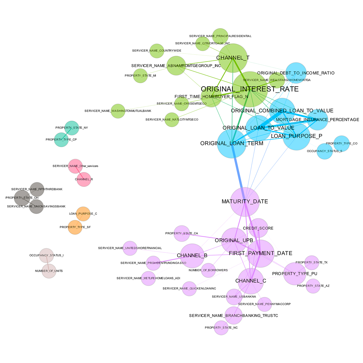
I have a dataframe and want to identify how the variables are correlated. I can get the correlation matrix easily using – df.corr(). I know I can easily plot the correlation matrix using plt.matshow(df.corr()) or seaborn's heatmap, but I'm looking for something like this - graph

I did a few searches on stack and elsewhere but all of them are correlation matrices where the values have been replaced by colors. Is there a way to achieve the linked plot?