I have a page with an outer div that wraps a header, content and footer div. I want the footer div to hug the bottom of the browser, even when the content div is not tall enough to fill the viewable area (i.e. there's no scrolling).
Asked
Active
Viewed 1.1e+01k times
83
-
main tag => min-hight : 100% or 95% – mercury Nov 15 '21 at 20:09
17 Answers
133
Your issue can be easily fixed by using flexbox. Just wrap your .container and your .footer in a flex container with a min-height: 100vh, switch the direction to column so that they stack on top of each other, and justify the content with space between so that footer will move to the bottom.
.flex-wrapper {
  display: flex;
  min-height: 100vh;
  flex-direction: column;
  justify-content: space-between;
}
<div class="flex-wrapper">
<div class="container">The content</div>
<div class="footer">The Footer</div>
</div>
WangYudong
- 4,256
- 4
- 29
- 53
Luke Flournoy
- 2,494
- 2
- 15
- 21
-
4
-
4I was looking on 20 websites for this solution ... only this finally works for me – Marek Bernád Mar 16 '19 at 00:14
-
2For an even cleaner tag layout you can also apply those rules to the body and drop the wrapper container. – tobius Aug 02 '19 at 17:06
-
-
Great answer. I [improved it slightly](https://stackoverflow.com/a/66565163/717214) by allowing header, then content from the top down, then footer being at the bottom (or below the fold) – Aleks G Mar 10 '21 at 12:56
-
Adding `flex-grow: 1` to the footer might also work well if you just want the footer background to extend to the bottom of the page, but have the footer content right after the container content. – Cully May 20 '21 at 02:02
-
When you work hard to polish your skills and see solutions like this you know you've got a lot of work to do as you've no more talents than people out there. Thank you for the artistic and humbling answer! – Andre W. Jan 12 '22 at 17:43
24
While this question is old, I want to improve slightly on the great answer by Luke Flournoy.
Luke's answer only works if you have two elements in the wrapper. It's very common to have at least 3: header, main content and footer. With these three elements, Luke's code will space them evenly vertically - most likely not what you want. With multiple elements, you can do this:
.flex-wrapper {
  display: flex;
  min-height: 100vh;
  flex-direction: column;
  justify-content: flex-start;
}

.footer {
  margin-top: auto;
}
<div class="flex-wrapper">
<div class="header">The header</div>
<div class="content">The content</div>
<div class="footer">The footer</div>
</div>
Aleks G
- 54,795
- 26
- 160
- 252
-
This works but it also forces all of the other items on your layout to be involved in the flex flow which isn't always desirable. – boylec1986 Dec 10 '21 at 16:08
-
@boylec1986 The question is specifically about header-content-footer setup; if you want something more advanced, you can put the "more advanced" bits inside content. – Aleks G Dec 10 '21 at 17:42
-
20
What I wanted was to have the footer be at the bottom of browser view ONLY IF the content was not long enough to fill up the browser window (non-sticky).
I was able to achieve by using the CSS function calc(). Which is supported by all modern browsers. You could use like:
<div class="container">CONTENT</div>
<div class="footer">FOOTER</div>
the css:
.container
{
    min-height: 70%;
    min-height: -webkit-calc(100% - 186px);
    min-height: -moz-calc(100% - 186px);
    min-height: calc(100% - 186px);
}
Change 186 to the size of your footer.
Jahmic
- 10,521
- 9
- 61
- 75
12
Use a blank div with flex-grow:1 to fill unused spaced right before the footer.
<body style="min-height: 100vh; display: flex; flex-direction: column;">

  Any content you want,
  put it here. Can be wrapped,
  nested, whatever.

<div style="flex-grow:1"></div>

<!-- Any content below this will always be at bottom. -->

<footer>Always way at the bottom</footer>
</body>
Extract the styles to css as needed. This works by setting <body> as display:flex;
Neal Bozeman
- 311
- 3
- 6
10
Example : http://jsfiddle.net/AU6yD/
html, body { height: 100%; }

#wrapper { min-height: 100%; height: auto !important; height: 100%; margin: 0 auto -30px; }
#bottom, #push { height:30px;}

body { background:#333;}
#header { height:30px; background:#000; color:#fff; }
#footer { height:30px; background:#000; color:#fff; }
<div id="wrapper">
<div id="header">
Header
</div>
<div id="push"></div>
</div>
<div id="bottom">
<div id="footer">
Footer
</div>
</div>
Martin Tournoij
- 24,971
- 24
- 101
- 136
haha
- 1,512
- 2
- 14
- 18
9
I did what Jahmic up top did (won't let me comment yet) except I had to use VH instead of % since I couldn't just apply it to a container class.
#inner-body-wrapper
{
    min-height: 70vh;
    min-height: -webkit-calc(100vh - 186px);
    min-height: -moz-calc(100vh - 186px);
    min-height: calc(100vh - 186px);
}
Healyhatman
- 1,288
- 1
- 12
- 21
4
You can do exactly what you want using Flexbox, as an example will be:
html, body {
    height: 100%;
    width: 100%;
}

.wrapper {
    display: flex;
    flex-direction: column;
    min-height: 100%;
}

.content {
    flex-grow: 1;
}
as a note the footer must be outside the content element
html structure will be something like follow:
<html>
    <body>
        <div class="wrapper">
            <header></header>
            <div class="content">
                <!-- Content -->
            </div>
            <footer></footer>
        </div>
    </body>
</html>
Jakub Kukul
- 9,209
- 2
- 41
- 48
3
To make it work responsively when the footer is taller on mobile devices compare to on desktop, you can't really know the footer height. One way to do it is to stretch the footer out to cover the entire screen.
html,
body {
  height: 100%;
}

.container {
  min-height: 80%;
  background-color: #f3f3f3;
}

.footer {
  background-color: #cccccc;
  box-shadow: 0px 500px 0px 500px #cccccc;
}
<div class="container">Main content</div>
<div class="footer">Footer</div>
nnattawat
- 666
- 5
- 11
1
body{
    position:relative;
    min-height:100vh;
}
footor{
     position:absolute;
    bottom:0%;
    width:100vw;
}
MOHIT
- 11
- 1
-
Welcome to Stack Overflow! It's always better to describe your code or how it is different from the other answers. – D J Jun 26 '21 at 10:16
-
This works. Best solution here! I never knew about `bottom: 0%`. I'm glad that I still look at answers that aren't the most popular (yet). – Anthony Avila Apr 01 '22 at 04:34
0
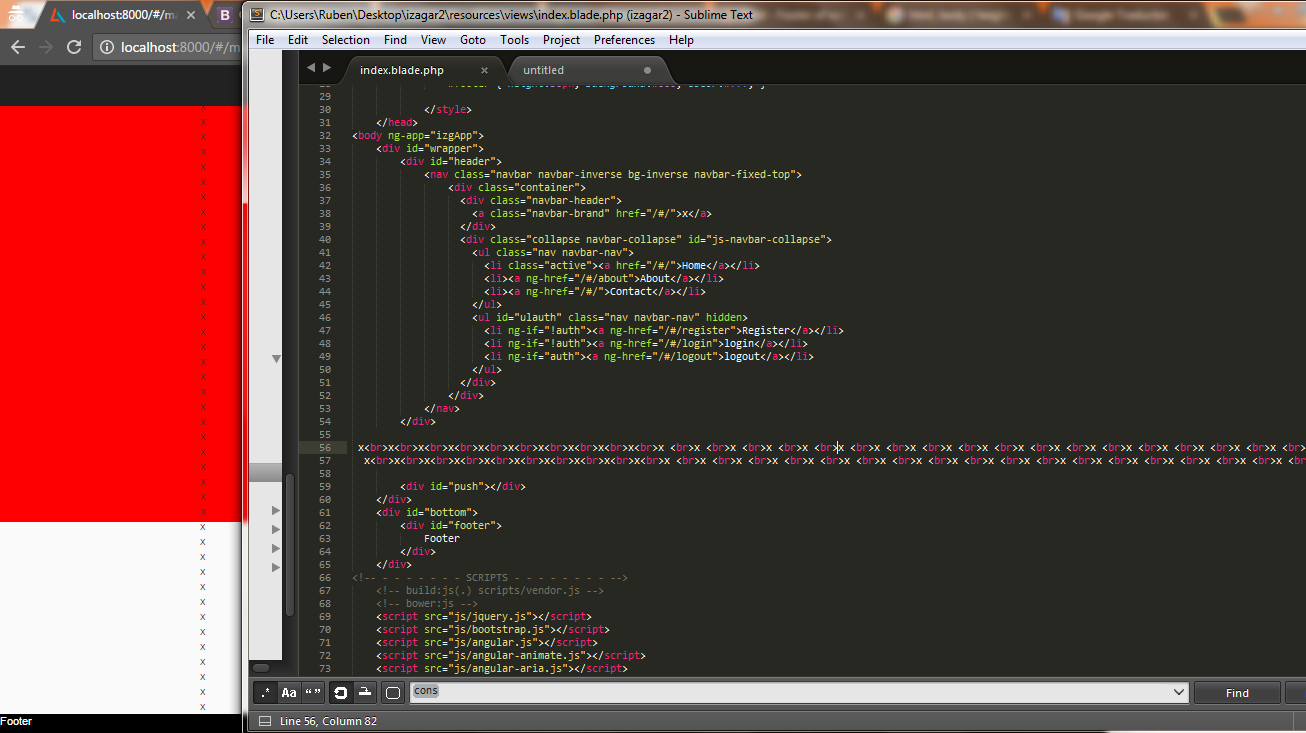
I tried: http://jsfiddle.net/AU6yD/ as here it's the best option but I had problems when the content of the <div id="wrapper"> started to get too big see
evidence.png, what I did to solve this was refreshing the body size everytime I changed the content of that div like this:
var body = document.body,
html = document.documentElement;
body.style.height = 100 + "%";
setTimeout(function(){
   var height = Math.max( body.scrollHeight, body.offsetHeight,
                          html.clientHeight, html.scrollHeight,
                          html.offsetHeight );
   body.style.height = height + "px";
}, 500);
Ruben Morales Felix
- 593
- 6
- 10
0
Try with this codepen.io/dendii/pen/LLPKJm media responsive
html, body {
  color:#fff;
}
.wrapper{
    box-sizing: border-box;
    display: -webkit-box;
    display: -webkit-flex;
    display: -ms-flexbox;
    display: flex;
    -webkit-box-orient: vertical;
    -webkit-box-direction: normal;
    -webkit-flex-direction: column;
    -ms-flex-direction: column;
    flex-direction: column;
    margin: 0 auto;
    min-height: 100vh;
}
.main{
  width:100%;
  overflow:hidden;
}
.main-inner {
  box-sizing: border-box;
  display: -webkit-box;
  display: -webkit-flex;
  display: -ms-flexbox;
  display: flex;
}
article,aside{
  float:left;
  padding:20px 10px;
}
article{
  width:70%;
  background:darkred;
}
aside{
  width:30%;
  background:darkblue;
}
.top {
  padding:20px 10px;
  height:100%;
  background:darkgreen;
}
.bottom,.text-mid {
  padding:20px 10px;
  height:100%;
  background:darkorange;
}
.text-mid {
  margin-top: auto;
  background:darkgrey;
}
@media (max-width: 768px){
  .main-inner{
    display: block;
  }
  article,aside{
    width:100%;
    float:none;
    display: block;
  }
}
<div class="wrapper">
<header class="top">
<h1>Header</h1>
</header>
<div class="main"><div class="main-inner">
<article>
blank content
</article>
<aside>
class sidebar
</aside>
</div></div>
<div class="text-mid">
<div class="center">
Whatever you want to keep.
</div>
</div>
<footer class="bottom">
<div class="footer">
Footer
</div>
</footer>
</div>Another alternative if you want a main-wrapper to adjust the screen EqualHeight
Dendii Gustiana
- 1
- 1
0
I've solved same problem with jquery
    var windowHeiht = $(window).height();
    var footerPosition = $("#asd-footer").position()['top'];

    if (windowHeiht > footerPosition) {
        $("#asd-footer").css("position", "absolute");
        $("#asd-footer").css("bottom", "0");
        $("#asd-footer").css("width", "100%");
    }
Asad
- 326
- 2
- 7
0
Reworking the jQuery solution. I have it working with resizing the window. When the window is bigger than the page, the footer style's position is "absolute" fixed at the bottom the window. When the window is smaller than the page, the footer stays at the bottom of the page - scrolling off the bottom.
<style>
    .FooterBottom {
        width:100%;
        bottom: 0;
        position: absolute;
    }
</style>
<script type="text/javascript">
    $(document).ready(function () {
        FooterPosition();

        $(window).resize(function () {
            FooterPosition();
        });
    });

    var originalFooterBottom = 0;

    function FooterPosition() {
        var windowHeight = $(window).height();
        if (originalFooterBottom == 0) {
            var footer = $("#Footer");
            originalFooterBottom = footer.position()['top'] + footer.height();
        }

        if (windowHeight > originalFooterBottom) {
            var footerElement = document.getElementById("Footer");
            if (!footerElement.classList.contains('FooterBottom')) {
                footerElement.classList.add('FooterBottom');
            }
        }
        else {
            var footerElement = document.getElementById("Footer");
            if (footerElement.classList.contains('FooterBottom')) {
                footerElement.classList.remove('FooterBottom');
            }
        }

    }
</script>
I tried many style only solutions but none of them worked. This Javascript/Style solution works just fine for me, even with its odd mix of jQuery and GetElement.
Thanks to Asad for his post.
George
- 199
- 1
- 5
- 12
0
i had just changed the position to sticky and set top to 100%.Then i go to its parent block and set its min height is 100% This solved my problem.
In my case the parent block was body so i changed the min height of body.
.footer {
position: sticky;
top: 100%;
text-align: center;
width: 100%;
height: 60px;
background-color: #1abc9c;}


body{
margin:0;
padding:0;
min-height:100vh;}
Akhil
- 21
- 6
-1
I tried this and it works fine so far
position:absolute;
bottom:0;
width:100%;
or
position:absolute;
bottom:0;
left:0;
right:0;
cha
- 19
- 9
-1
Wrap your footer with a class as following:
<div class="footer">
<h1>footer content</h1>
Then add following css properties to the footer:
.footer{
position: fixed;
bottom: 0;
}
-3
This is what I am doing for my page
<h6 style="position:absolute; bottom:0;">This is footer at bottom of page without scrollbars</h6>-
If there is div covering the whole page the proposed footer will not be pushed to the bottom, instead, it will stay where it is. – Ahmet Feb 20 '19 at 18:01