1

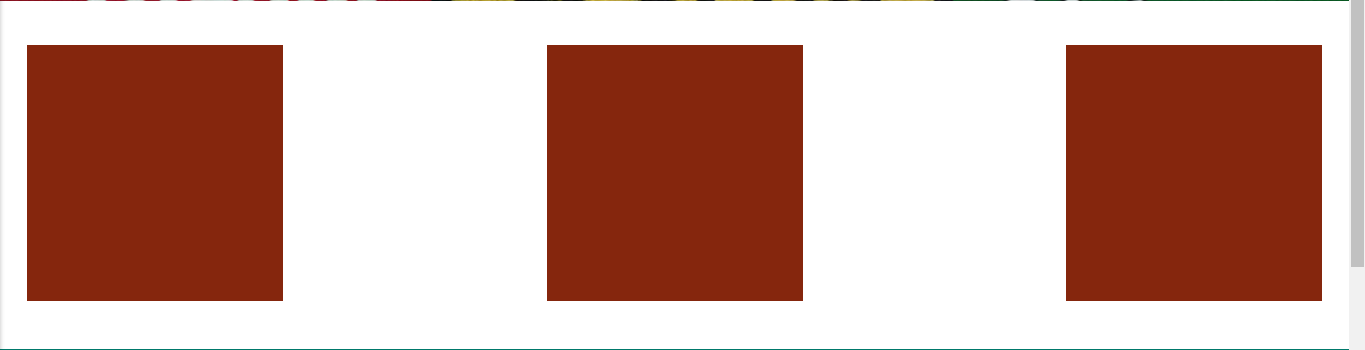
I'm making a webpage and need to center-align 3 divs as promo content, like that:

enter image description here

In order to get this spacing and alignment, I added invisible images and made then hidden on mobile, so they get responsive, like that:

<div id="promocontent">
  <img class="img-responsive" src="img/iconenope.png">
  <img class="img-responsive hidden hide-on-med-and-down" src="img/iconehidden.png">
  <img class="img-responsive" src="img/iconenope.png">
  <img class="img-responsive hidden hide-on-med-and-down" src="img/iconehidden.png">
  <img class="img-responsive" src="img/iconenope.png"><br><br>
</div>

CSS:

#promocontent {
display: flex;                  /* establish flex container */
flex-direction: row;            /* default value; can be omitted */
flex-wrap: nowrap;              /* default value; can be omitted */
justify-content: space-between; /* switched from default (flex-start, see below) */
padding: 5px;
}

Now, I need to add text on the center-bottom of these images, something like:

enter image description here

So, how can I do that (responsively working)? Align 2 lines of text (maybe 1, but 2 would be better).

Thank you.

Michael Benjamin
  • 307,417
  • 93
  • 525
  • 644
MucaP
  • 882
  • 1
  • 11
  • 18

2 Answers2

1

#promocontent {
  display: flex;
  justify-content: space-between;
  padding: 5px;
}
#promocontent > div {
  display: flex;
  flex-direction: column;
  align-items: center;       /* horizontally center child elements */
  text-align: center;        /* horizontally center text on narrow screens;
                                see http://stackoverflow.com/q/39678610/3597276 */
}
<div id="promocontent">
  <div>
    <img class="img-responsive" src="http://i.imgur.com/60PVLis.png" width="50" height="50" alt="">
    <h2>header text</h2>
    <span>text text text text text</span>
  </div>
  <div>
    <img class="img-responsive" src="http://i.imgur.com/60PVLis.png" width="50" height="50" alt="">
    <h2>header text</h2>
    <span>text text text text text</span>
  </div>
  <div>
    <img class="img-responsive" src="http://i.imgur.com/60PVLis.png" width="50" height="50" alt="">
    <h2>header text</h2>
    <span>text text text text text</span>
  </div>
</div>

https://jsfiddle.net/x2rzj1cu/2/

Michael Benjamin
  • 307,417
  • 93
  • 525
  • 644
0

I would avoid using an extra image for spacing and just rely on justify-content: space-between

Feel free to check out my codepen (basically the same as Michaels).

http://codepen.io/anon/pen/zKmaVJ

ilrein
  • 3,551
  • 4
  • 27
  • 45
  • Are there any advantages? Like what's wrong with my extra img? – MucaP Oct 18 '16 at 19:07
  • Nothing, except you're forcing the user to download unnecessary weight. We want as little as possible -- that's design perfection. You can also try ```space-around``` to experiment with the spacing. – ilrein Oct 18 '16 at 19:19