12

I have this sample:

link

CODE HTML:

<div class="select-style">
  <select>
    <option value="volvo">Volvo</option>
    <option value="saab">Saab</option>
    <option value="mercedes">Mercedes</option>
    <option value="audi">Audi</option>
  </select>
</div>

CODE CSS:

.select-style {
    padding: 0;
    margin: 0;
    border: 1px solid #ccc;
    width: 120px;
    border-radius: 3px;
    overflow: hidden;
    background-color: #fff;
    background: #fff url("http://www.scottgood.com/jsg/blog.nsf/images/arrowdown.gif") no-repeat 90% 50%;
}

.select-style select {
    padding: 5px 8px;
    width: 130%;
    border: none;
    box-shadow: none;
    background-color: transparent;
    background-image: none;
    -webkit-appearance: none;
       -moz-appearance: none;
            appearance: none;
}

.select-style select:focus {
    outline: none;
}

I put a picture to understand better what I want to do.

enter image description here

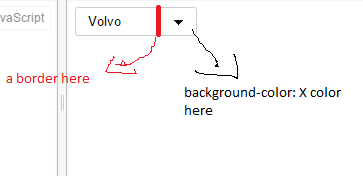
How can I do this on my structure?

Does the current structure? Or have another structure created HTML?

Thanks in advance!

Marius
  • 1,131
  • 2
  • 14
  • 23

3 Answers3

6

You can make use of linear-gradient combined with background-image.

  1. The background-image property allows combination of url() and linear-gradient() so you may try separating the values. Same for the background-position as we are controlling the url image position with 95px value while the linear gradient is undisturbed with center center.
  2. Using linear-gradient, The first 70% is filled with background color white while the other 30% will be light gray colored in the example.
  3. Create a border using a small fraction of the percentage value i.e. 70% gray to 71% gray in the linear gradient.

.select-style {
  background-image: url("http://www.scottgood.com/jsg/blog.nsf/images/arrowdown.gif"), linear-gradient(to right, white 70%, gray 70%, gray 71%, lightgray 71%, lightgray 100%);
  background-position: 95px center, center center;
  background-repeat: no-repeat;
  border: 1px solid #ccc;
  border-radius: 3px;
  margin: 0;
  overflow: hidden;
  padding: 0;
  width: 120px;
}
.select-style select {
  padding: 5px 8px;
  width: 130%;
  border: none;
  box-shadow: none;
  background-color: transparent;
  background-image: none;
  -webkit-appearance: none;
  -moz-appearance: none;
  appearance: none;
}
.select-style select:focus {
  outline: none;
}
<div class="select-style">
  <select>
    <option value="volvo">Volvo</option>
    <option value="saab">Saab</option>
    <option value="mercedes">Mercedes</option>
    <option value="audi">Audi</option>
  </select>
</div>
m4n0
  • 27,411
  • 26
  • 71
  • 84
4

You could use a :pseudo-element to do this.

Attach a :pseudo-element to the div and apply your desired background-color and border-left properties. To make it visible apply background-color: transparent to .select-style.

.select-style {
  position: relative;
  padding: 0;
  margin: 0;
  border: 1px solid #ccc;
  width: 120px;
  border-radius: 3px;
  overflow: hidden;
  background: transparent url("http://www.scottgood.com/jsg/blog.nsf/images/arrowdown.gif") no-repeat 90% 50%;
}
.select-style select {
  padding: 5px 8px;
  width: 130%;
  border: none;
  background-color: transparent;
  background-image: none;
  -webkit-appearance: none;
  -moz-appearance: none;
  appearance: none;
}
.select-style select:focus {
  outline: none;
}
.select-style:after {
  position: absolute;
  content: '';
  width: 36px;
  height: 100%;
  background-color: #ddd;
  border-left: 1px solid #ccc;
  top: 0;
  right: -1px;
  z-index: -1;
  border-radius: 0 1px 1px 0;
}
<div class="select-style">
  <select>
    <option value="volvo">Volvo</option>
    <option value="saab">Saab</option>
    <option value="mercedes">Mercedes</option>
    <option value="audi">Audi</option>
  </select>
</div>
Weafs.py
  • 22,199
  • 8
  • 51
  • 75
  • https://jsfiddle.net/852aseb0/8/ look at this update.How can I make the select tag to have backgrlound-color:blue? Now it`s red because it`s have background:transparent – Marius Oct 07 '15 at 06:39
3

Did you want something like this?

http://codepen.io/anon/pen/bVWmgP

.select-style:after {
          content: '';
          background-color: #000;
          position: absolute;
          border-left: 3px solid #F00;
          z-index: 0;
          top: 0;
          right: 0;
          bottom: 0;
          left: 85px;
        }

    .select-style:before {
        content: '';
        background-color: white;
        position: absolute;
        z-index: -20;
        top: 0;
        right: 0;
        bottom: 0;
        left: 0;
    }

Note: You won't be able to change select lists arrow color without adding an extra image that will represent that arrow.

Paran0a
  • 3,256
  • 3
  • 22
  • 44
  • http://codepen.io/anon/pen/bVWmvb look at this update...my select it`s red and I want to have background-color:white; – Marius Oct 07 '15 at 06:41
  • 1
    Did you look at @Manoj Kumar solution? It looks like it does what you want. – Paran0a Oct 07 '15 at 06:47
  • yes but I want to know how to do with your solution ... both are very interesti – Marius Oct 07 '15 at 06:53
  • http://codepen.io/anon/pen/bVWmgP Look at this , I also added :before pseudo element with a lover z-index that has white background. – Paran0a Oct 07 '15 at 06:55