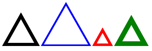
How can I create the following shape with CSS?
I tried this to be a solution:
 .triangle:after {
        position:absolute;
        content:"";
        width: 0;
        height: 0;
        margin-top:1px;
        margin-left:2px;
        border-left: 10px solid transparent;
        border-right: 10px solid transparent;
        border-bottom: 10px solid white;
    }

    .triangle:before {
        position:absolute;
        content:"";
        width: 0;
        height: 0;
        border-left: 12px solid transparent;
        border-right: 12px solid transparent;
        border-bottom: 12px solid black;
    }
You can see it working at Triangle. This is working, but with a trick of borders. Is there another way it could be done?
Using SVG vectors this can be done easily, but I don't want to go that lengthy way.

