From a layout perspective, it is possible using modern techniques.
Its made up (I believe) by Heydon Pickering. He details the process here: http://www.heydonworks.com/article/the-flexbox-holy-albatross
Chris Coyier picks it up and works through a demo of it here: https://css-tricks.com/putting-the-flexbox-albatross-to-real-use/
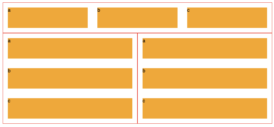
To restate the issue, below we see 3 of the same component, each made up of three orange divs labelled a, b and c.
The second two's blocks display vertically, because they are limited on horizontal room, while the top components 3 blocks are laid out horizontally.
It uses the flex-basis CSS property and CSS Variables to create this effect.
![Final example]()
.panel{
  display: flex;
  flex-wrap: wrap;
  border: 1px solid #f00;
  $breakpoint: 600px;
  --multiplier: calc( #{$breakpoint} - 100%);
  .element{
    min-width: 33%;
    max-width: 100%;
    flex-grow: 1;
    flex-basis: calc( var(--multiplier) * 999 );
  }
}
Demo
Heydon's article is 1000 words explaining it in detail, and I'd highly recommend reading it.
Update 2021/22
As mentioned in other answers, container queries are coming. There is a full spec for it, and its usage is detailed on MDN:
https://developer.mozilla.org/en-US/docs/Web/CSS/CSS_Container_Queries
and there is a polyfill to get browsers that don't yet support it up to speed:
https://github.com/GoogleChromeLabs/container-query-polyfill
There is a nice little overview video of it here:
https://www.youtube.com/watch?v=gCNMyYr7F6w