1

I have a large dataset that includes my strategy back-test run data. The dataset columns include candle date, close price and many strategy related data.

I’ve built a Mathplotlib visualization for my backtest run data. While my visualization works, working with Mathplotlib charts is tedious. I like to have something like Plotly.py’s Range Sliders shown here https://plotly.com/python/range-slider/

Before I spend time and migrate my visualization to another platform, I wanted to ask what are the efficient and productive options to visualize large timeseries market data? So far I’ve come up with the following options, but I am hoping to know if I am missing any common tool or library:

  • Tradingview’s Lightweight Charts - Open Source: Not sure if it can handle large datases
  • Plotly.py: Not sure if it can handle large datasest
  • Power BI

Am I missing any better tool, library or option?

Allan Xu
  • 109
  • 4

4 Answers4

2

I've been able to support a few demo applications with 3+ million data points in microsecond resolution on Highcharts, based around this example.

databento
  • 2,488
  • 12
  • 24
0

I know that in my company some of the algo traders are using Altair Panopticon to visualize real time trading data when plugged to a KDB database system. Not sure if they have a free version.

Mayeul sgc
  • 171
  • 4
0

If you like Plotly, Julia's graphing library can produce charts like this. It has the rangeslider, you can pan, box select, lasso select, all without adding much code. That's what it looks like in a Jupyter notebook:

enter image description here

Not sure if it is of interest if you are unfamiliar with Julia, but the language does have a few good selling points though. The most notable one being speed. It is also open source.

I did a speed comparison here which highlights the differences to Python. Since you asked about large data, Quantinsti has some good tests for Multiple operations on large datasets. For example, for 100 groups of ~10,000,000 rows, Python (pandas package) and R (dplyr package) resulted in an internal error and out of memory error, respectively while Julia took 2.4 seconds the first time and 1.8 seconds the second time.

It is also a very well designed language that allows you to quickly deal with overflow and floating point math issues as can be seen here.

There are other packages like Vegalite which are also very useful.

Last but not least, you have Plots.jl with TimeSeries.jl which is very flexible itself. Plots lets you switch quickly between backends like PlotlyJs, GR,... without even changing the code.

AKdemy
  • 9,269
  • 1
  • 23
  • 90
  • 1
    There is no doubt Julia is a superior language. However, in this particular case, Julia is not doing the bulk of the work. It just produces Plotly.js Javascript and html code. Julia is not running the graph you shown, your browser's Javascript runtime engine does. – Allan Xu Apr 17 '22 at 01:15
-1

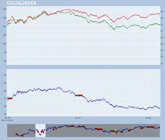
After spending sometime learning Plotly, Just wanted to share here and confirm that Plotly does an impressive job visualizing finance data.

Below is an example of Plotly char visualizing 200,000 candle bars. It is work in progress (30% done) but Plotly features are promising.

For larger dataset, the Pandas Datafarame should be re-populated in a Jupyter notebook or a presentable Dash UI dashboard.

enter image description here

The power of the machine rendering the chart is a key factor for the such heavy chart.

Allan Xu
  • 109
  • 4