Can someone explain how to build a burn-up chart? Please give me a walkthrough of how to build one?
Asked
Active
Viewed 2.0k times
17
-
2Asking about burn-up is definitely on-topic. However, step-by-step tutorials are generally out of scope everywhere on StackExchange, and may get a question closed as "Not a Real Question" because it is overly-broad. – Todd A. Jacobs Sep 08 '12 at 16:09
3 Answers
13
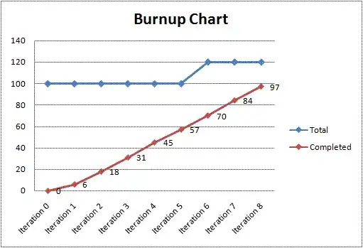
Basically, a burnup chart is simply a graph plotting both the total story points across the project, and the amount of done story points (both on ordinates), over all iterations (on abscissa). See for example this comparison with burndown charts.
So, in order to build a burnup chart, you simply have to do the following for each iteration:
- sum story points across the whole project (done + current + backlog; including the icebox is up to you but I would advise against it as it could lead to odd jumps, lived this in a project where epics with huge story points were in the icebox and later deleted, halved the story points amount);
- sum story points in “done” state;
- plot them on a graph.
From the same source as above:
This walkthrough gives an example based on SharePoint, but you can most likely extract all important information from it :)
MattiSG
- 935
- 6
- 18
-
Hi Matt, the goal of Stack Exchange is to become a resource of knowledge for years to come. While the link may be helpful today, if it were to break, your answer would be useless. Consider making an [edit] to include the most important details of building a burn-up chart in the body of your answer, or remove this and add it as a helpful comment to the question. Good luck! – jmort253 Sep 07 '12 at 14:44
-
2@jmort253 Yup, right, thanks, that made me write an actually useful answer ;) – MattiSG Sep 07 '12 at 20:51
-
+1 for a good answer, but the referenced "comparison" is bogus. Both a burn-down and a burn-up can plot total points; that's not a valid distinction between the two. – Todd A. Jacobs Sep 08 '12 at 15:48
-
@CodeGnome I agree the referenced comparison tries to present burnups as “improved burndowns” rather than highlighting their profound similarities and slightly different uses. Though, this was the simplest illustrated introduction I found after a short search on the web… If you really think it is misleading, I could remove the reference. Still not sure it is not useful at this point. – MattiSG Sep 08 '12 at 18:01
-
1No, I think it's a useful example of a burn-up, so I'd leave it as-is unless you find a more compelling example somewhere. I just didn't want to leave the referenced link's conclusion unchallenged. – Todd A. Jacobs Sep 08 '12 at 19:16
2
Burn-Down vs. Burn-Up
The difference between a burn-down chart and a burn-up chart is simply the way it represents the information. A project isn't done until work remaining is zero, so a burn-down chart is often more intuitive as it doesn't require the plotting of an intersection with project totals to represent project completion. The intersection of the X and Y axes on the right of the chart is an implicit end-of-cycle with burn-down.
Otherwise, the differences between the two chart types are minimal. Specifically:
- A burn-down chart shows work that remains incomplete in a project or iteration.
- A burn-up chart shows work completed during a project or iteration.
Building the Chart
In either case, you build the chart by graphing points that represent the work-effort on the project. This is often represented by story points, but can be in whatever units you track such as man-hours, ideal hours, features, or even dollars.
Note that a burn-up chart will require a legend or an explicit second line identifying the project total you are building towards, unless you continually adjust the scale of the Y-axis to make the top of the axis an implicit total. Regardless of how you represent it, with burn-up just make sure you represent the total somewhere to provide the burn-up metric with a valid scale.
Todd A. Jacobs
- 50,264
- 7
- 59
- 177
1
To plot a Burn Up Chart – plot work completed per day in story points and compare it with estimated work completed. Say you need to complete 20 story points per sprint i.e. 10 working days. If you complete 4 story points in the first day then you will plot 4 on the graph. The next day you complete 4 more story points then you will plot 8. So on and so forth. Map this to the expected story points and you have a burn up chart.
Warsha Bhatia
- 11
- 1