Sometimes in mangas there are points where you would expect normally furigana. What meaning is it supposed to have?
Sometimes in mangas there are points where you would expect normally furigana. What meaning is it supposed to have?
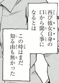
The dots, called 傍点【ぼうてん】 (or 圏点【けんてん】), function like italics or underline with the Latin alphabet. They are for emphasis.
To see the effect in rōmaji:
futatabi kanojo jishin no kuchi kara kiku koto ni naru to wa
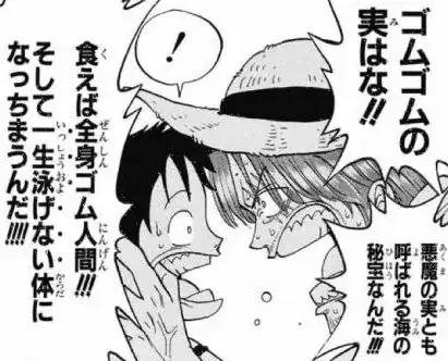
Update. To answer the question in the comments, 傍点 and ふりがな may be combined (although ふりがな may also be omitted, as in the snippet in the question body). ONE PIECE isn't exactly a case study of minimalist typography (I'm counting at least 7 text fonts), but for completeness here is an example of 傍点 on top of (or rather, to the side of) ふりがな:
Update 2. Note that 傍点 may take different shapes. In Japanese both ● and ﹅ are common. For more information see
Usually a text would use one type of 傍点, but just for its curiosity value here is a snippet of a book by Miyatake Gaikotsu titled 奇態流行史 and published in 1922 with a rather eclectic use of emphasis points:
