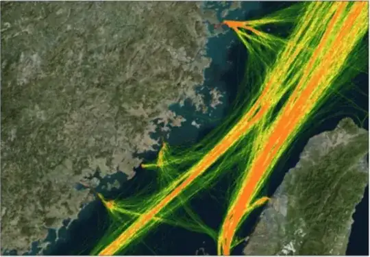
Data: ships AIS trajectory Data with longitude and latitude. (that data is a CSV file with several columns:id,time,lon,lat,etc.)//
I transform the point to line, every line is a ship trajectory. Now I want to make a trajectory heatmap to express the traffic flow of the different sea areas.
I think the map above is very well. I used the processing method: Polyline to raster, and adjust the relevant parameters. But the outcome has problem: if the cell is small, the raster lines will have a serrated edge. Ever I used the line density to calculate a raster and overlayer this raster onto the original trajectory. Then I adjust the color of them, but the maps are unsatisfactory because their shape did not match well.
I saw that kind of map above in some theses, different colors represent different trajectory densities which puzzles me for a long time. Are there some GISer could share your similar experience?
