2

A lettrine or drop cap is a large initial letter (usually with some illustration) at the start of a chapter in a book.

In the English language, which is preferable: "lettrine" or "drop cap"? Incidentally, is it correct to indent a lettrine?

JSBձոգչ
  • 54,843
user02138
  • 473
  • 3
    (1) Lettrine is not an English word. (2) This is a question of style, not language usage, and as such, is off-topic for this site. – Marthaª Aug 08 '11 at 06:23
  • Hi user02138. I think that your question would be a much better fit for Writers.SE, as this has nothing to do with language usage itself. –  Aug 08 '11 at 06:26
  • 1
    How is this question or this question any different? – user02138 Aug 08 '11 at 06:44
  • Or perhaps this question.... – user02138 Aug 08 '11 at 06:50
  • I disagree. If there are so many questions of style and punctuation on this site, then I believe this one fits just fine. – user02138 Aug 08 '11 at 06:56
  • @user02138 Your first example is a new question which has not had time to be voted on closing. Your second and third are both old questions which may not be worth closing at this time. In any case, none are good fits for EL&U. –  Aug 08 '11 at 07:21
  • Perhaps it's true that these are not typical questions for EL&U. It's hard to know what's appropriate when there are questions like this. – user02138 Aug 08 '11 at 08:04
  • That question was one of the first, before there was a Writers.SE. Now there is, so this question (and older questions of the sort) are no longer fully within the scope of EL&U. As it is, there are other voters besides myself who believe this off-topic. –  Aug 08 '11 at 08:10
  • Most questions on typography do in fact get closed. Thanks for linking to those questions, we should probably have closed the last two of them imo. I suggest further debate on whether typography is off-topic takes place on meta. I don't think there is any question that punctuation is on-topic, however. – z7sg Ѫ Aug 08 '11 at 09:49
  • 4
    @simchona (and to the OP) The truly correct place for this question is http://graphicdesign.stackexchange.com: typography is a matter of design, not the English language or writing. – Matthew Frederick Aug 08 '11 at 14:27

2 Answers2

4

Non-hanging drop caps are indeed indented in the sense that they don't hang outside of the paragraph: the left side of the initial letter or letters does align with the left edge of the rest of the paragraph.
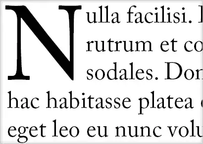
Modern Drop Cap
Modern Drop Cap

Hanging drop caps hang out to the left of the paragraph and are less common in print; I suspect the rarity is primarily due to the fact that they're more difficult to create than indented drop caps when using modern page layout software. Conversely, hanging drop caps are (generally) easier than non-hanging ones on web pages and so may be seen there more often.
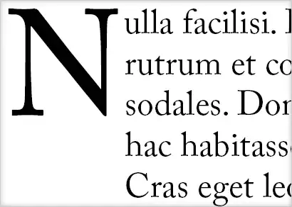
Hanging Drop Cap
Hanging Drop Cap

Just in case: if you're asking if the drop cap should be indented farther to the right than required to make the left edge of the paragraph line up with the rest of the paragraph -- the way regular paragraphs are commonly indented in books and periodicals -- the answer is no, that is rarely appropriate.

Indented Drop Cap
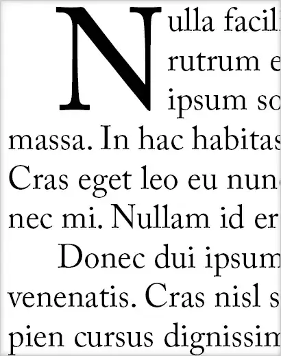
Indented Drop Cap (uncommon)

0

Apparently not:

Home > drop cap drop cap
In desktop publishing, the first letter of a paragraph that is enlarged to "drop" down two or more lines, as in the next paragraph. Drop caps are often seen at the beginning of novels, where the top of the first letter of the first word lines up with the top of the first sentence and drops down to the four or fifth sentence.

So, even in modern times, drop caps would look like this

To give an image to see what I mean by lining up with the top of the first sentence, take a look at this:

enter image description here

See how the drop cap lines up with the top of the next sentence, so that the drop cap is not indented, but lined up.

Thursagen
  • 41,919
  • 1
    It's unclear to me how you're interpreting the bolded section of your quote to mean that the letter isn't indented. It's saying that the top of the initial letter lines up with the top of the first line. It doesn't address the left side of the letter at all. – Matthew Frederick Aug 08 '11 at 06:28